
Luxury Car Hire Website Design Mockup – Branding Case Study
A premium website and brand identity concept for a luxury car rental company. This mockup presents a complete visual direction for a high-end car hire brand, including homepage design, car listing layout, individual vehicle page, brand elements, typography, colour palette, booking sections and Wix Studio design guidance. The design is created to show how a luxury rental business can build trust, highlight premium vehicles and guide customers smoothly towards booking or enquiry.

Luxury Car Hire Website Design Mockup – Branding Case Study
A premium website and brand identity concept for a luxury car rental company. This mockup presents a complete visual direction for a high-end car hire brand, including homepage design, car listing layout, individual vehicle page, brand elements, typography, colour palette, booking sections and Wix Studio design guidance. The design is created to show how a luxury rental business can build trust, highlight premium vehicles and guide customers smoothly towards booking or enquiry.
PROJECT OVERVIEW
Project Detail | Description |
Project Type | Luxury car hire website design mockup and branding case study |
Brand Name | Prestige Drive |
Industry | Premium car rental, luxury car hire and private vehicle hire |
Project Purpose | To show how a luxury car rental company could use professional website design and branding to build trust, present premium vehicles and guide users towards booking or enquiry |
Website Platform Concept | Wix Studio |
Design Style | Dark, cinematic, elegant, premium and conversion-focused |
Brand Personality | Luxury, reliable, confident, refined, trustworthy and service-focused |
Main User Goal | Browse available cars, view detailed vehicle information and send an enquiry or booking request |
Main Business Goal | Present the company as a premium car hire provider with clear pricing, professional presentation and a simple customer journey |
Pages Included | Homepage, car listing page, individual car item page, about page and brand elements presentation |
Branding Materials Included | Logo direction, colour palette, typography, iconography, UI components, imagery direction, Wix Studio layout guidance and CMS structure |
Case Study Status | Fictional concept project created for portfolio presentation and branding demonstration. This is not a real client project. |
MOKAUPS
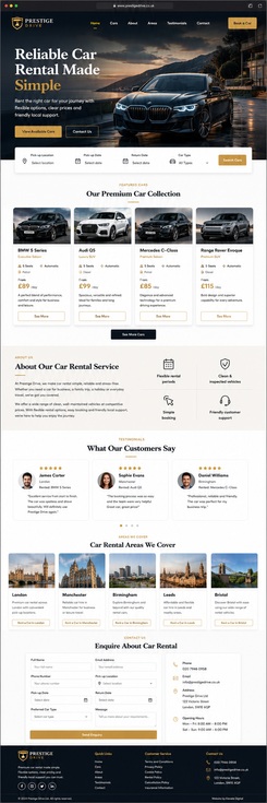
The project includes a set of website mockups showing the main customer journey across the brand. These mockups demonstrate how the website could appear on key pages, including the homepage, car listing page, individual vehicle page and about page.
The homepage introduces the brand with a cinematic hero section, luxury car imagery, clear call-to-action buttons, featured vehicle cards, service benefits, testimonials, car rental areas and an enquiry section.
The car listing page shows how available luxury vehicles could be presented in a structured card layout, with brand filters, prices, vehicle specifications and clear “See More” buttons.
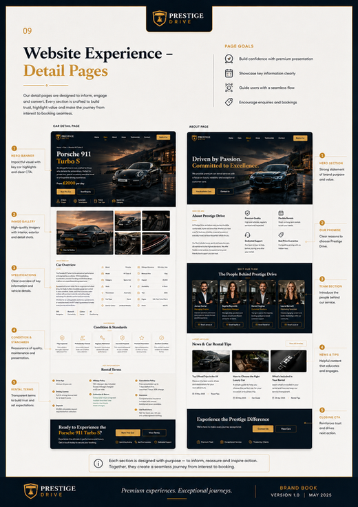
The individual car page demonstrates how one premium vehicle could be displayed in detail, including a strong hero section, price per day, key specifications, gallery, car overview, condition standards, rental terms and booking call-to-action.
The about page presents the brand story, service values, team section and article previews, helping the business appear professional, trustworthy and established.



BRANDING BOOK
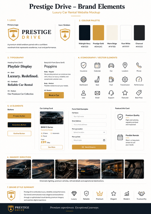
The project also includes a branding book for the Prestige Drive concept. The branding book explains how the visual identity should be used across the website and how the design system can stay consistent across different pages.
The branding book includes guidance for colours, typography, logo usage, iconography, buttons, UI elements, image style, page layouts, CMS structure and responsive website behaviour. It acts as a visual design guide for building the mockup into a professional Wix Studio website.
The purpose of the branding book is to show that the project is not only a visual mockup, but also a structured brand system. It explains how each design element should work together to create a consistent luxury car hire experience.








This case study presents a luxury car hire website design mockup and branding concept for a fictional premium rental company called Prestige Drive. The project was created to show how a car rental business can build a professional, elegant and trustworthy online presence through strong visual branding, clear page structure and a premium customer journey.
The design uses dark cinematic hero sections, luxury car photography, gold call-to-action buttons, clean white content areas and elegant typography to create a high-end look. The mockup includes a homepage, car listing page, individual car item page and about page, showing how the brand could work across the full website experience.
This project is not a real client website. It is a conceptual branding and website design mockup created for portfolio and case study purposes. It demonstrates possible visual direction, page layout, brand identity, Wix Studio structure and user experience strategy for a luxury car hire business.
PROJECT OVERVIEW
Prestige Drive is presented as a premium car hire brand focused on luxury, reliability, clear pricing and professional customer service. The website mockup was designed to help visitors quickly understand the service, browse available vehicles, view individual car details and send an enquiry or booking request.
The main goal of the project was to create a visual identity that feels premium but still simple to use. The website needed to look elegant and aspirational while keeping important rental information easy to find. The design combines strong first impressions with practical booking-focused sections.
PROJECT PURPOSE
The purpose of this case study is to demonstrate how a luxury car rental company could be presented through a complete brand and website design system. The mockup shows how colours, typography, imagery, iconography, page layouts and user interface components can work together to create a consistent professional brand.
The project also shows how a car hire website could be structured in Wix Studio using reusable sections, dynamic pages, repeaters and CMS collections.
BRAND CONCEPT
The Prestige Drive brand is built around luxury, trust and ease of booking. The visual style is confident, premium and refined. The brand is designed for customers who want a stylish, reliable and professional car rental experience for business travel, special occasions, weddings, events or private hire.
The brand personality is elegant, modern, trustworthy, aspirational and service-focused. Every design choice supports the feeling of premium quality, from the dark hero images to the gold buttons, structured cards and clean booking sections.
BRAND VALUES
LuxuryReliabilityTrustPremium customer serviceClear pricingSimple booking processProfessional presentationHigh-quality vehiclesElegant customer experienceLocal and accessible support
VISUAL DIRECTION
The visual direction is dark, cinematic and aspirational. Large luxury car images are used to create strong emotional impact. Dark navy overlays, charcoal backgrounds and warm gold accents help the website feel premium and exclusive.
Clean white and ivory sections are used for readability, vehicle information, forms and listing content. This balance allows the website to feel luxurious without becoming difficult to use.
The design style is based on:Dark luxury hero sectionsWarm gold call-to-action buttonsEditorial serif headingsClean sans-serif body textPremium car photographyElegant iconographySimple card-based layoutsConsistent header and footer structureClear booking and enquiry sections
COLOUR PALETTE
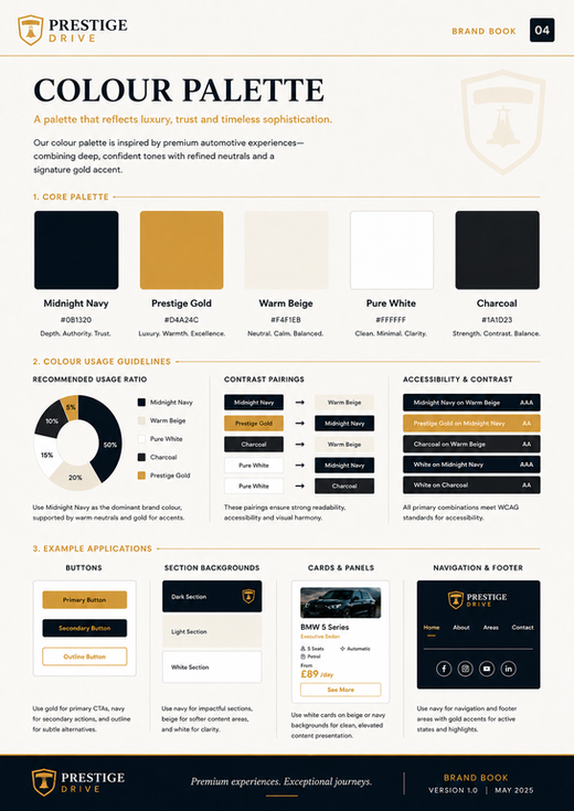
The colour palette is based on a dark premium foundation with gold highlights and clean neutral backgrounds.
Prestige Navy – used for headers, footers, hero overlays and premium dark strips.Night Charcoal – used for dark panels, cards and contrast areas. Luxury Gold – used for buttons, icons, active states and important highlights. Gold Hover – used for button hover states and small accents.Warm Ivory – used for soft background areas.Clean White – used for cards, forms and listing sections. Ink Text – used for main text on light backgrounds.Soft Grey – used for secondary text, meta copy and placeholders.
The recommended visual balance is mostly dark and white, with gold used carefully as an accent. Gold should highlight important actions, not dominate the whole page.
TYPOGRAPHY
The typography combines luxury editorial style with modern readability. Serif headings are used for hero titles and main section headings to create a premium brand feeling. Clean sans-serif text is used for body copy, buttons, forms, navigation and vehicle details.
Suggested heading style: Playfair Display, Cormorant Garamond or a similar elegant serif font.Suggested body style: Poppins, Inter, Avenir, Helvetica or a similar clean sans-serif font.
Hero headlines should be large, bold and limited to two or three lines. Body text should remain clear, readable and easy to scan. Buttons should use strong sans-serif text to support clear action.
LOGO DIRECTION
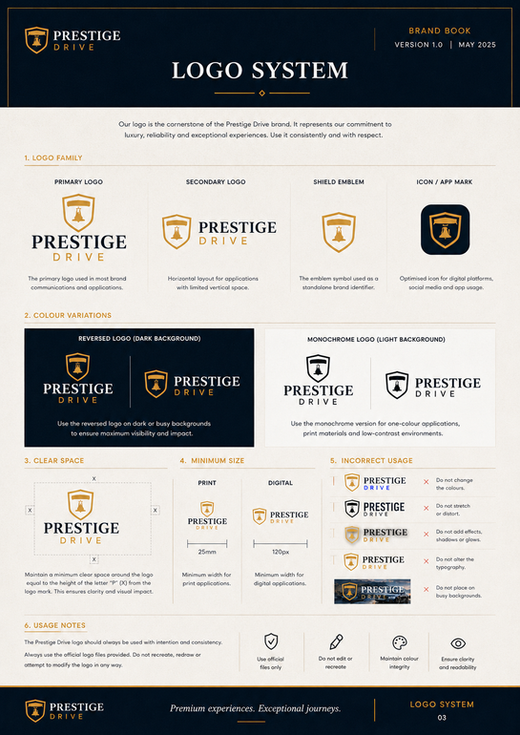
The Prestige Drive logo uses a shield-style emblem with a premium wordmark. The shield communicates trust, protection and professional service. The gold and white colour combination works strongly on dark backgrounds.
The logo should be used consistently across all pages, especially in the header and footer. It should not be stretched, recoloured, cropped or placed on busy light images. Enough clear space should be kept around the logo so it remains easy to see.
WEBSITE STRUCTURE
The website mockup includes a complete page family for a luxury car hire brand. Each page follows the same visual system, using consistent header styling, dark hero sections, gold buttons, white content areas, card layouts and a premium footer.
Pages included in the case study:HomepageCar listing pageIndividual car item pageAbout pageBrand elements pageBrand book / design system guidance
HOMEPAGE DESCRIPTION
The homepage is designed to create a strong first impression. It opens with a cinematic hero section featuring a luxury car, bold headline, short supporting text and clear call-to-action buttons. A booking search area is placed below the hero to guide users towards finding a car quickly.
The homepage also includes featured car cards, an about section, service benefits, testimonials, areas served, enquiry form and contact information. This structure helps the visitor understand the brand, explore the offer and take action without confusion.
CAR LISTING PAGE DESCRIPTION
The car listing page presents available luxury vehicles in a clean and structured card layout. Brand filter buttons help users browse by vehicle type or manufacturer. Each car card includes a premium image, car name, short description, price per day, key specifications and a “See More” button.
This page is designed to make browsing simple and visually appealing. The card system can be connected to a Wix CMS collection, making it suitable for dynamic content and future website expansion.
INDIVIDUAL CAR ITEM PAGE DESCRIPTION
The individual car item page is designed to present one luxury vehicle in detail. The example page focuses on a Porsche 911 Turbo S and uses a strong hero section with vehicle name, short description, price per day and key specifications.
Below the hero, the page includes a gallery, car overview, detailed specifications, condition and standards section, rental terms and a final booking call-to-action. This structure gives the customer enough information to feel confident before sending an enquiry or booking request.
ABOUT PAGE DESCRIPTION
The about page builds trust and explains the brand values behind Prestige Drive. It includes a premium hero section, brand story, service benefits, team cards and latest article previews. The page helps the company feel established, professional and customer-focused.
The design keeps the same dark and gold visual identity while using clean content sections to explain who the company is and why customers should trust the service.
USER EXPERIENCE STRATEGY
The user journey is designed to be simple and clear. Visitors can quickly understand the service, browse available cars, compare vehicle options, view detailed car information and send an enquiry.
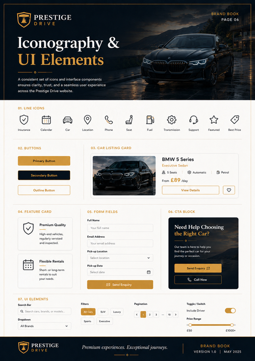
Important actions are supported by clear buttons such as:Book a CarView Available CarsSend EnquiryRent This CarSee MoreContact Us
The design balances luxury presentation with usability. Premium visuals attract attention, while structured content sections make the information easy to read.
CONVERSION STRATEGY
The website uses repeated call-to-action buttons and enquiry sections to guide visitors towards contact or booking. Pricing is shown clearly on vehicle cards and item pages to build trust. Key benefits such as flexible rental periods, clean inspected vehicles, simple booking and friendly support are repeated throughout the design.
The final call-to-action sections are placed after the user has seen the car details, rental terms and quality promise. This helps create a more confident booking decision.
BRANDING ELEMENTS INCLUDED
Logo systemColour paletteTypography guidanceIconographyButton stylesCar listing cardsForm field examplesFeature cardsImage directionHero section styleFooter designWix Studio strip structureResponsive rulesSEO and accessibility checklist
UI COMPONENTS
The project includes reusable website components suitable for Wix Studio. These components help keep the design consistent across all pages.
Main components include:Primary gold buttonSecondary outline buttonNavigation menuHero sectionSearch / booking barCar listing cardVehicle specification iconsFeature cardTeam cardTestimonial cardArea cardBlog cardContact formCTA stripFooter columns
WIX STUDIO DESIGN SYSTEM
The mockup is suitable for Wix Studio because it uses repeatable strips and consistent layout rules. Pages can be built from structured sections such as header, hero, listing area, content blocks, CTA strips, forms and footer.
Recommended layout rules:Use a maximum content width of approximately 1180–1280 px.Use consistent spacing between strips.Use dark and light sections alternately.Keep buttons and cards consistent.Use soft shadows only.Use simple corners for buttons and cards.Keep all content inside safe responsive containers.
WIX CMS STRUCTURE
The project can be expanded using Wix CMS dynamic pages. Vehicle cards and item pages can be connected to a car collection, allowing the website owner to manage cars from one database.
Suggested CMS collections:Cars collectionTeam collectionAreas collectionBlog articles collectionTestimonials collectionRental terms collection
Suggested Cars collection fields:BrandModelSlugMain imageGalleryShort descriptionFull descriptionPrice per daySeatsTransmissionFuel typeCategoryMileage allowanceMinimum hireDepositAvailabilityYearEnginePowerExterior colourFeaturesSEO titleSEO description
RESPONSIVE DESIGN
The design should remain premium and clear across desktop, laptop, tablet and mobile.
On desktop, the website can use large hero sections, wide layouts and multi-column car cards. On laptop, the spacing should be reduced slightly while keeping the premium structure. On tablet, cards and content blocks should use fewer columns. On mobile, the layout should become one card per row with full-width buttons and a simplified navigation menu.
The mobile version should keep the same brand identity but avoid overcrowded sections, small text or difficult form fields.
SEO STRATEGY
The mockup includes strong potential for SEO because the website can use dynamic car pages, local area pages, service pages and blog content. Each car can have its own SEO-friendly item page, and each location can have a dedicated area page.
Recommended SEO elements:Unique SEO title for every pageUnique meta description for every pageOne clear H1 heading per pageAlt text for all car and gallery imagesInternal links between homepage, car listing, car item pages and area pagesLocal area landing pages for car hire searchesFAQ sections where relevantSchema markup for LocalBusiness, Service, Vehicle, FAQ and BreadcrumbsOptimised image sizes for fast loading
ACCESSIBILITY CONSIDERATIONS
Premium design should still remain accessible and easy to use. The design should use strong contrast between text and background, readable font sizes, clear buttons and visible form labels.
Recommended accessibility rules:Use body text at least 15–16 px.Use strong contrast on dark sections.Keep button labels clear and descriptive.Use visible form labels, not only placeholders.Make focus states visible for keyboard users.Compress images carefully without losing quality.Avoid text over busy image areas.Use dark overlays behind hero text.
IMAGERY DIRECTION
The imagery direction is based on dark, cinematic and premium car photography. Images should feel aspirational and polished, using evening light, reflective surfaces, luxury
What is included in this luxury car hire website design case study?
This case study includes a complete visual concept for a fictional luxury car hire brand, including homepage mockup, car listing page, individual vehicle page, about page, brand elements, colour palette, typography, iconography, UI components, Wix Studio layout guidance and CMS structure.
Is Prestige Drive a real car rental company?
No. Prestige Drive is a fictional concept brand created for portfolio and case study purposes. The project is designed to demonstrate how a premium car rental business could look online through professional branding, website mockups and a structured Wix Studio design system.
How does this mockup support a premium customer journey?
The mockup supports the customer journey by using clear navigation, cinematic hero sections, premium vehicle cards, visible prices, detailed car pages, enquiry buttons, contact sections and trust-building brand elements. The design helps visitors browse cars, understand the offer and move towards booking or enquiry.