
Canadian Businesses: Web Design for Trust, Clarity and Growth

Canada is not one generic digital market. A business may serve a neighbourhood, several provinces, a bilingual professional audience or customers distributed across a vast geography. The website has to make that operating reality legible without becoming a collection of disconnected location pages and slogans.
For Canadian Businesses, strong web design is the translation of a commercial position into a clear system: who the offer is for, where and how it is delivered, what evidence supports it, and which next step makes sense for each visitor.
This article is organised as a design-review dossier. Each section identifies a question to test, the evidence to look for and the failure pattern to avoid.
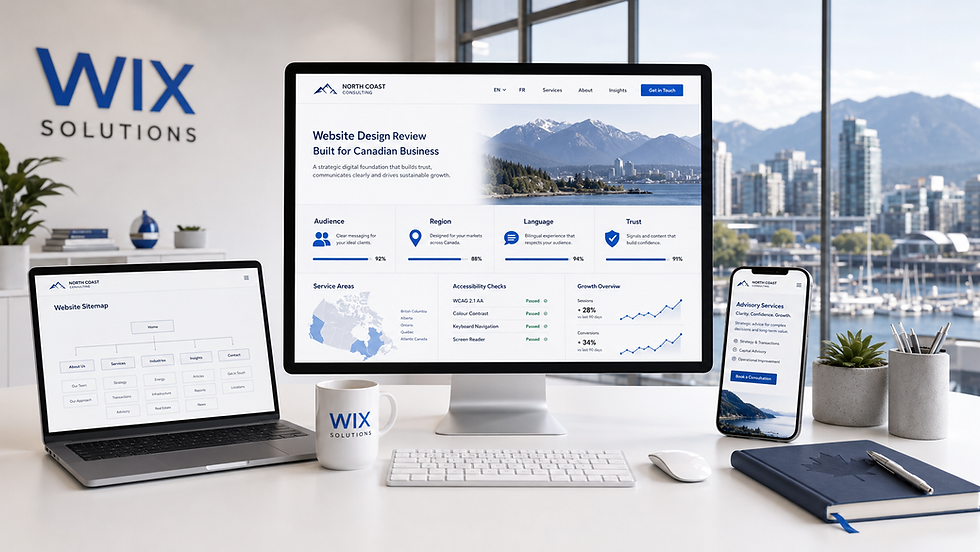
Canadian Businesses need a precise market position
The home page should identify the type of customer, the problem or outcome, the delivery model and the next step. “Proudly Canadian” may support identity, but it does not explain suitability. A buyer still needs to know whether the business serves consumers or organisations, local or national markets, simple or complex needs.
Write a positioning sentence that can survive without design. Then test whether the page hierarchy expresses it. The title and opening section should create orientation; service choices should reflect real needs; proof should appear beside meaningful claims; geography should clarify delivery rather than decorate the footer.
Audience: Which customer group must recognise itself first?
Problem: What practical or emotional tension brings that customer to the site?
Difference: What method, expertise, access or standard makes the offer credible?
Scope: Where, when and through which delivery model is the service available?
Action: What can a qualified visitor reasonably do next?
The Wix Solutions Wix Website Design service helps connect positioning with page structure, responsive design and SEO foundations. Our website design glossary explains the discipline in plain language.
Design trust for the decision being made
Trust is contextual. A local home service may need clear service areas, response expectations, licences where relevant and recent project evidence. A national B2B consultancy may need named expertise, a rigorous process, governance and case material. A product business may need specifications, delivery, returns and support.
Replace decorative trust badges with verifiable evidence. Identify the claim, the concern behind it and the strongest available proof. Put that proof close to the decision. A testimonial on a separate page cannot resolve a technical buyer’s question about implementation; a logo wall cannot explain what the work achieved.
Early-stage businesses can build honest trust without pretending to have a long history. Show founder expertise, samples, a transparent process, precise scope, working policies and the quality of the first interaction. Trust grows when the website makes realistic promises and keeps them.
Plan geography around service reality
Geographic content should help a visitor understand availability and relevance. If a company works remotely across Canada, explain time zones, onboarding, delivery and support. If it operates within defined local areas, provide accurate service coverage and useful location-specific information.
Do not manufacture near-duplicate city pages by changing place names. A location page earns its place when it contains distinct evidence: the service model in that area, local constraints, examples, response times, delivery information, team access or genuinely useful answers.
The principles of local SEO connect geographic relevance with a complete customer journey. A search result can create visibility; the page must still create understanding and action.
Treat language as experience design
A multilingual website is not a pile of translated sentences. Navigation, forms, confirmations, metadata, downloads, images and support expectations all contribute to the language experience. Decide which audiences need equivalent journeys and who owns each version after launch.
Use qualified, context-aware language work where accuracy matters. Literal translation can weaken positioning, misrepresent terminology or create an uneven tone. Layouts should accommodate changes in word length, line breaks and reading rhythm without forcing smaller text.
Language availability should be clear at the start of the journey. A visitor should not discover at the final form that the promised language is missing. The content model, CMS fields and approval process should support maintenance as services change.
Build for variable devices and connections
Canadian customers may browse from an office workstation, a phone during a commute, a tablet on site or a slower connection outside a major centre. Responsive design therefore protects the sequence of meaning, not merely the width of the layout.
Prioritise readable type, purposeful images, clear controls and resilient forms. Serve appropriately sized media, avoid autoplay that competes for bandwidth and keep essential information outside decorative images. Test real tasks on ordinary devices.
Read Responsive Web Design: A User-Experience Framework for Every Screen and use the Wix Mobile Editor Guide plus Wix Image Settings guide during quality assurance.
Make accessibility part of quality
Accessible design improves access to information, controls and transactions. Structure pages with meaningful headings; ensure sufficient contrast; support keyboard use and visible focus; provide text alternatives; label forms; write useful error messages; and allow zoom and larger text without losing content.
Accessibility requirements can vary by organisation, sector and jurisdiction. Confirm the standards and legal obligations that apply to the business rather than relying on a template claim. Whatever the compliance position, inclusive design is a quality practice that widens participation and reduces avoidable friction.
Test with automated tools and human judgement. Automated checks can identify patterns, but they cannot decide whether content is understandable, alternatives convey purpose or a complex journey works with assistive technology.
Connect the website to measurable growth
A business website should create useful actions: qualified enquiries, bookings, applications, sample requests, purchases, distributor contacts or informed offline conversations. Define those actions before arranging sections.
Match each page to a stage of consideration. Educational pages explain the problem; service pages establish suitability; case studies provide evidence; comparison and FAQ content reduce risk; contact or booking journeys make commitment clear. Internal links should help movement, not merely distribute keywords.
Measure quality as well as quantity. More form submissions can be a poor result if the redesign attracts unsuitable enquiries or hides essential qualification information. Review completion, lead fit, source, assisted journeys and the questions people still ask.
Three illustrative Canadian web design cases
These composite cases show different design conditions. They are not claims about named clients or invented performance figures.
Case study 1: a Vancouver clean-technology consultancy
The consultancy served founders, investors and municipal teams, but its site presented one undifferentiated technical narrative. Each audience struggled to locate relevant proof. The redesign introduced audience entry points, a shared methodology, sector-specific case evidence and one consistent consultation process.
The visual system used diagrams and project evidence instead of generic sustainability imagery. The lesson: a specialist business can serve several stakeholders when the information architecture makes their questions distinct without fragmenting the brand.
Case study 2: a Montréal creative studio
The studio wanted English and French prospects to receive equivalent journeys. The old site translated portfolio captions but left navigation, enquiry fields and project outcomes uneven. The new content model required both language versions before a project could be published.
Flexible components accommodated different text lengths, and reviewers checked tone rather than words alone. The lesson: multilingual quality depends on governance and interface flexibility, not a translation switch by itself.
Case study 3: a Calgary industrial supplier
The supplier served buyers across several provinces. Its website listed products but did not explain territory, lead times, installation support or compatibility. The redesign grouped products by buyer task, added specification fields, mapped service coverage and connected technical questions to the right contact route.
Local and regional pages were created only where operating information and evidence differed. The lesson: geographic SEO becomes valuable when it expresses how the business actually delivers.
Continue with Canadian Entrepreneurs: How to Build a Free Website That Can Grow, Why Canadian Business Owners Should Choose Wix and The Role of Content Writing in Canadian Web Services. For a project perspective, browse our case studies and the Website Designer Agency Case Study.
Canadian Businesses design-review checklist
The opening section identifies the priority audience, offer, scope and next step.
Trust evidence is specific, verifiable and placed beside the claim it supports.
Geographic pages contain distinct delivery information rather than swapped place names.
Language journeys include navigation, forms, confirmations, metadata and ownership.
Responsive layouts preserve reading order, controls and essential content.
Accessibility is tested through structure, keyboard use, contrast, zoom, alternatives and errors.
Every important page has a defined role in the customer decision journey.
Analytics measure qualified actions and reveal unanswered customer questions.
Components and content fields can be maintained without one-off redesigns.
Questions and answers
Does a Canadian business need a .ca domain?
Not always. Domain choice should reflect audience, brand, availability and international plans. A .ca address can signal a Canadian relationship, while other extensions may suit international positioning. Domain strategy does not replace clear content or trust.
Should a national business create a page for every city?
Only when each page provides distinct, accurate value. Near-duplicate pages can confuse visitors and weaken the site. Start with genuine service regions and evidence; expand where delivery and customer needs justify it.
How should bilingual content be planned?
Define which journeys require equivalent language support, use qualified language expertise, design flexible components and assign ongoing owners. Translate navigation, forms, confirmations and metadata as part of the experience.
What makes a Canadian website feel trustworthy?
Specific scope, clear contact and response expectations, relevant proof, accurate policies, accessible design and coherent language. National symbols alone do not establish competence.
Can one Wix website serve local and national audiences?
Yes. Use clear audience and service structures, meaningful regional information, internal links and appropriate calls to action. The design should explain where the offer changes and where it remains consistent.
What should be improved first?
Fix the barrier closest to a valuable customer decision: unclear positioning, missing evidence, confusing navigation, weak mobile use, inaccessible controls or a form that does not set expectations.
Design for the market you actually serve
An impactful Canadian business website is not created by adding maple leaves to a generic template. It earns trust by expressing the offer, geography, language, evidence and next step with precision.
If your Wix or Wix Studio site needs a clearer design system for Canadian customers, contact Wix Solutions. We can help connect structure, responsive design, content and search foundations.
Bibliography
Norman, Don. The Design of Everyday Things. Revised and Expanded edition, 2013.
Lidwell, William; Holden, Kritina; and Butler, Jill. Universal Principles of Design. 3rd edition, 2023.
Krug, Steve. Don’t Make Me Think, Revisited: A Common Sense Approach to Web Usability. 3rd edition, 2014.
Redish, Janice. Letting Go of the Words: Writing Web Content that Works. 2nd edition, 2012.


