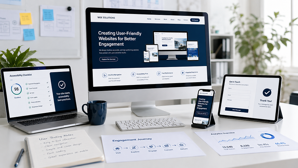
Responsive Web Design: A User-Experience Framework for Every Screen

A responsive page is not a desktop layout compressed until it fits a phone. It is a system that preserves meaning, priority and operability as space, input method, orientation, zoom and content change. The central question is not “Which device are we designing for?” but “What must remain understandable and usable under changing conditions?”
Responsive Web Design answers that question through flexible layout, adaptable media, content-led breakpoints and progressive enhancement. Its quality is measured in the continuity of the user journey: a visitor should be able to identify the page, compare options, complete an action and recover from an error without being disadvantaged by screen size.
This article develops a practical framework for business websites built in Wix and Wix Studio, connecting interface decisions with accessibility, performance, content governance and measurable customer outcomes.

What Responsive Web Design really means
The term describes an approach in which one content system can respond to different viewing conditions. Layout may change from columns to a sequence; navigation may change presentation; type may use a fluid scale; images may use different crops or resolutions; complex controls may expose a simpler path. The information remains coherent even though its arrangement changes.
That distinction matters. A page can technically fit within a small viewport and still fail responsively because the reading order is illogical, controls are difficult to reach, a comparison loses its labels or a form requires excessive effort. Good website design treats responsiveness as a property of the whole experience, not a final visual check.
Four dimensions should be considered together:
Perception: Can people read, distinguish, zoom and understand the content?
Operation: Can controls be reached and used with touch, keyboard, pointer and assistive technology?
Comprehension: Does the information hierarchy remain logical when components move or collapse?
Resilience: Does the page remain useful with slow connections, missing media, long content and unusual settings?
Start with content order, not breakpoints
A responsive interface begins with a meaningful source order. Read the page without styling: does the sequence still make sense? On a large screen, CSS can place related elements side by side; on a narrow screen, the document order usually becomes visible. If the source order was chosen for appearance alone, the mobile reading experience and keyboard sequence may be confusing.
Define the page’s core task, supporting evidence and optional enrichment. For a service page, the task may be to understand suitability and request a consultation. The proposition, scope, process, evidence and action are core. A decorative animation is optional. This classification helps the design adapt without hiding information simply because space is limited.
Use content-led breakpoints
Breakpoints should appear where the composition stops working, not where a list of popular device widths says it should change. Resize the canvas gradually and observe when lines become uncomfortable, cards become too narrow, navigation wraps, labels collide or the relationship between elements becomes unclear.
A small set of well-tested breakpoints is usually easier to maintain than many device-specific exceptions. Between breakpoints, use flexible widths, grid and controlled fluid sizing. Test with realistic content, including long headings, large text settings, translated labels and empty states.
A responsive decision table
Decision | Weak approach | Responsive approach |
Breakpoints | Copy common device widths without testing content. | Add a breakpoint where layout, reading or operation begins to fail. |
Typography | Shrink text until everything fits. | Preserve readable body text; adjust measure, spacing and heading scale. |
Navigation | Hide every link behind an icon. | Prioritise common routes and provide a labelled, operable menu when needed. |
Images | Serve one oversized crop everywhere. | Select useful crops and resolutions while protecting meaning and alternatives. |
Controls | Keep desktop-sized targets and hover-only cues. | Provide generous targets, visible states and non-hover equivalents. |
Typography must respond without surrendering hierarchy
Responsive typography is a relationship between size, line length, spacing and hierarchy. Body text that is too small creates effort; text that becomes very wide slows scanning; oversized headings can push the page purpose below the first screen. Use a readable base, a controlled measure and fluid steps that do not produce sudden jumps.
Allow text to wrap. Avoid fixed-height boxes around live copy, and test the interface at increased text sizes. Buttons should expand with their labels. Cards should tolerate unequal descriptions. A robust system accommodates editorial reality instead of requiring every sentence to match a mock-up.
Navigation should preserve orientation
Mobile navigation is not automatically a hamburger icon. The right pattern depends on the number and priority of routes. A small service site may keep two primary links visible and place secondary routes in a labelled menu. An e-commerce site may need search, basket and account access at the top level.
Whatever the pattern, communicate location and state. Page titles, breadcrumbs where useful, selected navigation states and clear back routes help visitors understand where they are. Menus must open, close and move focus predictably with keyboard and assistive technology.
Adapt images and media to the decision
Responsive images have two jobs: deliver an appropriate file and preserve the subject. A wide desktop photograph may place the product at one side, while a narrow crop removes it entirely. Plan art direction as well as compression. Decorative images may be reduced or omitted; evidential images—product details, diagrams, people, accessibility information—must remain available.
Specify dimensions to reduce layout movement, use concise alternative text for informative images and avoid embedding essential copy in graphics. The Wix image settings guide covers practical media configuration.
Design responsive components, not isolated pages
A business website grows through repeated components: service cards, project previews, FAQs, testimonials, pricing, forms and calls to action. Each component needs rules for width, content length, alignment, order, focus and empty states.
A card grid, for example, may move from four columns to two and then one. That is only the beginning. Are headings aligned because of fixed heights? Does the action remain attached to the correct card? What happens when one description is twice as long? Can a keyboard user reach every card in a logical sequence? Responsive quality lives in these ordinary cases.
For implementation support, explore Wix Website Design and the Wix Mobile Editor Guide.
Forms are a responsive stress test
Forms expose weak layouts quickly. Labels, guidance, error messages, selection controls, consent and confirmation all compete for space. Use visible labels, logical grouping and input types suited to the requested data. Keep the primary action clear, but do not remove context that people need before sharing information.
Error messages should identify the field, explain the problem and preserve entered data. Do not rely on colour alone. On small screens, place validation close to the relevant control and ensure the virtual keyboard does not obscure the action or message.
Performance and responsiveness are connected
A layout that adapts visually but transfers unnecessary media and scripts is not fully responsive to the user’s context. Prioritise critical content, resize images, delay non-essential code and avoid interactions that require large libraries for a small decorative effect.
Performance decisions should be tested on representative mobile connections and mid-range devices, not only a fast office computer. Measure real journeys where possible: loading the first useful content, responding to an input and keeping layout stable. The technical SEO glossary explains how performance sits within a wider technical foundation.
Accessibility is not a separate viewport
Responsive design should support people who zoom, increase text size, rotate a device, use a keyboard, dictate input or browse with a screen reader. Do not disable zoom. Ensure content reflows rather than requiring two-dimensional scrolling except where the content itself demands it, such as a large data table.
Where a table is essential, preserve headers and offer a usable small-screen treatment rather than turning every cell into an unlabeled block. Motion should respect reduced-motion preferences. Pointer targets need sufficient size and separation. Focus indicators must remain visible against every responsive background.
Three illustrative responsive-design case studies
The following are fictional composite scenarios created for education. They are not named client claims and do not guarantee specific conversion outcomes.
Case study 1: a professional-services comparison page
A consultancy presents three service tiers in a wide table. On mobile, the table is scaled down until the text is unreadable. The redesign identifies the actual comparison decisions—scope, workshop time, deliverables and support—and creates a labelled card sequence for narrow screens. A link still exposes the complete comparison for visitors who need detail.
The source order follows the decision sequence, and each tier keeps its heading when stacked. The lesson: responsiveness did not mean hiding columns; it meant redesigning the comparison around comprehension.
Case study 2: a fashion e-commerce product page
A product page uses a large editorial gallery, sticky purchase panel and hover-based fabric details. On touch devices, the gallery dominates the first screens and the hover information disappears. The responsive version introduces the product name, price and key options earlier, supplies a clear swipe affordance and turns fabric notes into an operable disclosure.
The sticky action appears only after the visitor has encountered the purchase controls and never covers policy content. The lesson: mobile commerce requires a new priority order, not only smaller images.
Case study 3: a learning dashboard
A training platform displays progress, modules, deadlines and resources in a dense dashboard. The first mobile version stacks every desktop panel, creating a long page with no hierarchy. Research with representative tasks shows that learners most often resume a module, check the next deadline or find feedback.
The revised dashboard leads with those actions, moves secondary analytics into a separate view and keeps progress meaning intact for screen readers. The lesson: responsive information architecture sometimes requires a different grouping while preserving the same underlying content.
For a wider example of component and visual-system thinking, see the Website Designer Agency Case Study.
How to test a responsive website
Test the unstyled order. Confirm that headings, content and actions make sense before layout is applied.
Resize continuously. Find failure points between standard device presets.
Use real content extremes. Try long labels, large text, missing images, empty results and validation errors.
Change input methods. Use touch, keyboard, pointer and assistive technology where available.
Rotate and zoom. Check orientation changes and text or page zoom without lost content.
Test representative devices. Include mid-range phones and ordinary connections, not only flagship hardware.
Complete business tasks. Compare, enquire, book, buy, search and recover from mistakes.
Record defects by impact. Prioritise blockers to comprehension and completion before cosmetic differences.
Responsive Web Design quality checklist
The page purpose and main action remain clear at every supported width.
Reading order and keyboard order are logical when columns collapse.
Text remains readable and containers expand with real content.
Navigation, forms and disclosures are operable without hover.
Images use appropriate crops, dimensions, alternatives and file sizes.
Zoom, orientation change and increased text do not remove information.
Critical journeys are tested on representative devices and connections.
Questions businesses ask
Is responsive design the same as mobile-friendly design?
Mobile-friendly is a broad outcome. Responsive design is one approach to achieving it across a range of conditions. A site can fit a phone yet remain difficult to read or operate, so evaluation must include tasks, content order and accessibility.
How many breakpoints should a website use?
There is no universal number. Use as few as the content and components need, and add them where the design stops working. Too many device-specific exceptions can make the system brittle.
Should mobile content be shorter?
It should be well structured, but not automatically incomplete. Prioritise and layer information; remove repetition and decoration before removing facts needed for a decision. The same visitor may research a complex purchase on a phone.
Does responsive design improve SEO?
It supports usability, crawlable content, mobile access and performance, all of which contribute to a healthy site. It does not guarantee rankings. Relevance, technical condition, reputation and competition still matter.
Can Wix and Wix Studio create responsive websites?
Yes. Wix Editor provides mobile-specific adjustments, while Wix Studio offers responsive layout tools and breakpoints. The result still depends on planning, content, component rules and testing.
When should a responsive site be redesigned?
Redesign when the underlying structure, components or content model cannot support current journeys without repeated exceptions. Isolated defects may be corrected without replacing the entire system. Audit before deciding scope.
Responsiveness is continuity of experience
The strongest responsive websites do not feel like reduced desktop sites. They preserve the purpose, evidence and next step while adapting presentation to available space and interaction. Responsive Web Design is therefore both a technical method and an editorial discipline: it asks teams to decide what matters, how elements relate and what must never be lost.
Read Creating User-Friendly Websites for Better Engagement and The Key Elements of a Modern Website for complementary guidance, or contact Wix Solutions to review a Wix or Wix Studio website across real devices and user journeys.
Bibliography
Marcotte, Ethan. Responsive Web Design. 2nd edition, 2014.
Wroblewski, Luke. Mobile First. 1st edition, 2011.
Pickering, Heydon. Inclusive Design Patterns: Coding Accessibility into Web Design. 1st edition, 2016.
Rogers, Yvonne; Sharp, Helen; and Preece, Jennifer. Interaction Design: Beyond Human–Computer Interaction. 6th edition, 2023.