
Creating User-Friendly Websites for Better Engagement

A website is user-friendly when people can understand where they are, find what they need and complete an important task without unnecessary effort. That sounds simple, yet real business websites must serve different audiences, devices, abilities and levels of knowledge. Clarity has to survive complex services, changing content and operational constraints.
Better engagement does not mean keeping visitors on a page for as long as possible. A person who finds an emergency contact number in ten seconds may have an excellent experience. A visitor who spends eight minutes struggling with a booking form has not. Engagement should be judged by useful progress, not attention alone.
Wix Solutions creates user-friendly websites by connecting information architecture, accessible interaction, responsive design, performance, content and the business process behind each task. The goal is a site that feels straightforward for customers and manageable for the team that owns it.
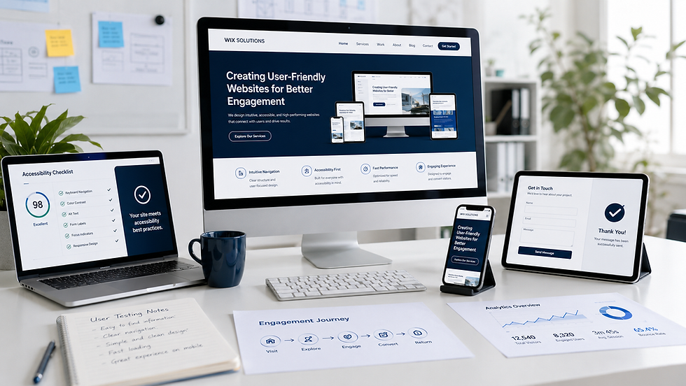
How User-Friendly Websites Create Better Engagement
User-friendly websites create better engagement by reducing the effort between intention and outcome. Visitors do not arrive to admire a menu; they arrive to compare a service, check availability, understand a process, request help, make a booking or decide whether to trust the organisation. Design should preserve that intention throughout the journey.
The strongest experiences make the next step visible without hiding alternatives. They use the language customers recognise, provide information at the moment it becomes relevant and prevent errors before they happen. When a task cannot be completed immediately, the website should explain what will happen next.
Begin with real user tasks
A project should start with evidence about what people need to do. Analytics can reveal popular paths and abandonment, but they do not explain every reason. Customer questions, search terms, form submissions, call logs, staff interviews and usability tests add context. Together they identify the tasks that deserve priority.
Write each task in plain language: ‘Find an urgent dental appointment’, ‘Compare two cottages with step-free access’ or ‘Check whether the software integrates with our data platform’. These statements are more useful than broad goals such as ‘improve UX’ because they can guide content, structure and testing.
Build an information architecture people can predict
Information architecture determines how pages, labels and relationships are organised. Good navigation uses terms that make sense outside the business. Internal department names and clever marketing phrases can create ambiguity when customers are looking for a familiar service.
Group content around audience needs and decisions rather than the organisation chart.
Use descriptive labels that remain clear when viewed without surrounding context.
Provide more than one route to important information when needs overlap.
Show location within the structure through headings, breadcrumbs or selected navigation states.
Avoid duplicating near-identical pages unless each has a distinct purpose.
Review search and filter terms so they match the vocabulary customers use.
Make every page answer four questions
A useful page should quickly answer: What is this? Is it relevant to me? What evidence helps me decide? What can I do next? The order can vary, but these questions provide a practical editorial test. If essential reassurance is buried beneath a long introduction, the visual design cannot compensate.
Content should also anticipate risk and uncertainty. A new patient may need to know what happens at the first appointment. A software buyer may need implementation and security information. A holiday guest may need precise accessibility details. Relevant reassurance is part of usability.
Design forms to support completion
Forms are conversations expressed through fields. Ask only for information needed at that stage, group related questions, label every input clearly and explain why sensitive information is required. Error messages should identify the problem and the remedy without deleting work.
Where several routes exist, let the user choose before displaying a long form. Emergency and routine enquiries, sales and support, or volunteering and service requests may require different questions and response expectations. Confirmation should state what was submitted, when a reply is expected and what to do if circumstances change.
Responsive design should preserve priority
A mobile layout is not successful merely because it fits the screen. The order of information, size of controls, behaviour of filters, keyboard type, loading cost and visibility of help all matter. Test with real devices and realistic conditions, including slow connections, zoom and long content.
Desktop experiences also need care. Wide screens can create excessive line lengths, scattered calls to action and forms that look shorter but become harder to scan. Responsive design should adapt the relationship between elements, not only their width.
Accessibility is a foundation, not an extra
Keyboard navigation, focus visibility, semantic headings, readable contrast, alt text, captions, labelled fields and controllable motion make a site usable for more people. They also improve robustness across devices and situations. Accessibility should be considered in components, content and quality assurance from the start.
Automated checks can identify some problems, but human review remains necessary. A page may pass a technical contrast test while the reading order is confusing. A form may have labels but still ask an unclear question. Task-based testing reveals how the pieces work together.
Performance protects the experience
Heavy media, unnecessary scripts and poorly configured components can delay the moment a page becomes usable. Optimise images for their displayed size, load non-essential media later, avoid excessive animation and monitor real pages after launch. Performance work should not remove useful context; it should deliver it efficiently.
For a broader checklist of structural, technical and content essentials, read Key Elements Every Successful Website Should Have.
Measure successful engagement
Choose measures that reflect the user’s intention. For an information task, success may be finding the correct answer without contacting support. For a transaction, it may be completion with few errors. For a considered purchase, it may be a qualified enquiry after relevant pages have been viewed.
Task completion and time on task in usability tests.
Form starts, completions, validation errors and abandonment points.
Use of filters, search, comparisons and help content.
Qualified enquiries, bookings, applications or purchases.
Repeat visits and post-transaction self-service.
Customer feedback and recurring questions received by staff.
Performance and accessibility issues by template and device.
Do not optimise a metric in isolation. Removing useful information may shorten a journey while reducing confidence. Adding an aggressive pop-up may increase sign-ups while harming other tasks. Review quantitative and qualitative evidence together.
Illustrative case studies: five different user journeys
The following case studies are fictional composites. All business names, people, testimonials, charts, dashboards and performance figures shown in the graphics are illustrative. They do not represent Wix Solutions client results or guaranteed improvements.
Case study 1: Dental practice
Situation: A dental practice served existing patients, new patients and urgent cases through the same navigation and contact form. Important information about first visits and anxiety support was difficult to find on mobile.
UX response: The website separated emergency and routine paths, explained the new-patient journey and connected treatment pages with practitioner profiles and booking. The form used clear labels and confirmation, while reassurance content answered common concerns without making medical promises.
What to assess: Successful emergency routing, appointment completion, form errors, repeated phone questions, mobile task success and feedback from anxious or first-time patients.

Case study 2: Vehicle dealership
Situation: A regional dealership displayed a large vehicle stock, but weak filters and inconsistent descriptions made comparison difficult. Finance, part-exchange and test-drive actions competed for attention.
UX response: Listings used consistent specifications and live availability. Filters reflected real shopping criteria and could be adjusted easily on mobile. Comparison, part-exchange and test-drive journeys retained vehicle context. Finance information was presented clearly without promising acceptance or outcomes.
What to assess: Filter use, listing-to-enquiry progression, stock accuracy, comparison use, test-drive completion, mobile errors and the quality of vehicle-specific enquiries.

Case study 3: Community charity
Situation: A community charity served people seeking support as well as donors, volunteers and event participants. The existing structure assumed users understood internal programme names, and content updates depended on one staff member.
UX response: A plain-language service finder organised help by need and location. Volunteering, giving and event routes remained distinct. Accessibility, language support, safeguarding and privacy information were visible at relevant points. A content workflow clarified who drafted, checked and published updates.
What to assess: Service-finder completion, successful referrals, event and volunteer sign-ups, accessibility feedback, unsuccessful searches and staff time spent maintaining current information.

Case study 4: B2B software provider
Situation: A software company described platform features in technical detail but made it difficult for prospects to evaluate fit. Use cases, integrations, pricing, documentation and demo requests felt like separate sites.
UX response: Navigation began with customer problems and use cases, then linked to relevant features and integrations. Pricing explained plan differences without hiding important conditions. Documentation search and implementation content supported self-service, while the demo form collected enough context for a useful conversation.
What to assess: Use-case discovery, integration searches, pricing comparison, documentation success, demo completion, qualified lead rate and recurring pre-sales questions.

Case study 5: Holiday-cottage operator
Situation: A holiday-cottage operator had attractive photography but weak availability search and inconsistent amenity information. Guests had to open several pages to compare accessibility, pet policies and essential facilities.
UX response: Search began with dates and party details, then allowed transparent filtering and side-by-side amenity comparison. Property pages used consistent information, an interactive map and detailed accessibility notes. The booking journey preserved selections and gave a complete confirmation.
What to assess: Search-to-property progression, filter success, booking completion, abandonment by step, accessibility enquiries, direct booking and support questions before arrival.

A practical user-friendly website process
Define priority audiences and the tasks that matter to them and the business.
Gather evidence from analytics, searches, enquiries, staff and representative users.
Map the current journey and identify uncertainty, duplication and failure points.
Create and test the information architecture and page hierarchy.
Prototype important tasks before final visual design.
Build accessible, responsive components with clear content rules.
Connect forms, bookings, search, e-commerce and other systems deliberately.
Test tasks, devices, accessibility, performance, content and notifications.
Launch with monitoring and a clear method for reporting problems.
Improve the website using evidence rather than isolated preferences.
Engagement continues beyond the website. Top Approaches to Drive Engagement Online explains how useful interactions can connect with content, email and customer relationships.
Frequently asked questions
What makes a website user-friendly?
A user-friendly website makes important tasks easy to understand and complete. It uses clear structure and language, accessible interactions, responsive layouts, reliable performance and helpful feedback. The standard should be tested with real tasks rather than judged only by appearance.
How can I improve website engagement?
First define what useful engagement means for the page. Then remove barriers: clarify the message, strengthen information hierarchy, improve navigation, simplify forms, increase performance and make the next step relevant. Measure completion and quality as well as clicks.
How many menu items should a website have?
There is no universal number. The menu should represent a clear, meaningful structure that people can scan. A smaller menu is not automatically better if it hides essential destinations, and a larger menu can work when groups and labels are well organised.
Do animations make a website more engaging?
Animation can explain change, provide feedback or guide attention, but unnecessary motion can distract, delay tasks and create accessibility problems. Use it purposefully, keep it restrained and respect reduced-motion preferences.
How Wix Solutions designs for useful engagement?
Wix Solutions combines discovery, information architecture, UX and UI design, accessible content, responsive implementation, Wix integrations and measurement. We design around the decisions customers need to make and the processes the business can reliably support.
The result is not a site that merely looks simple. It is a considered experience that handles complexity clearly, helps more people complete meaningful tasks and gives the owner a practical foundation for improvement.
For the wider commercial impact of this approach, see The Unseen Impact of Professional Website Design on UK Business Success.
Bibliography
Krug, Steve. Don't Make Me Think, Revisited: A Common Sense Approach to Web Usability. 3rd edition. New Riders, 2014.
Norman, Don. The Design of Everyday Things. Revised and expanded edition. Basic Books, 2013.
Kalbach, James. Mapping Experiences: A Complete Guide to Creating Value through Journeys, Blueprints, and Diagrams. 2nd edition. O'Reilly Media, 2020.
Johnson, Jeff. Designing with the Mind in Mind: Simple Guide to Understanding User Interface Design Guidelines. 3rd edition. Morgan Kaufmann, 2020.
Wroblewski, Luke. Web Form Design: Filling in the Blanks. 1st edition. Rosenfeld Media, 2008.


