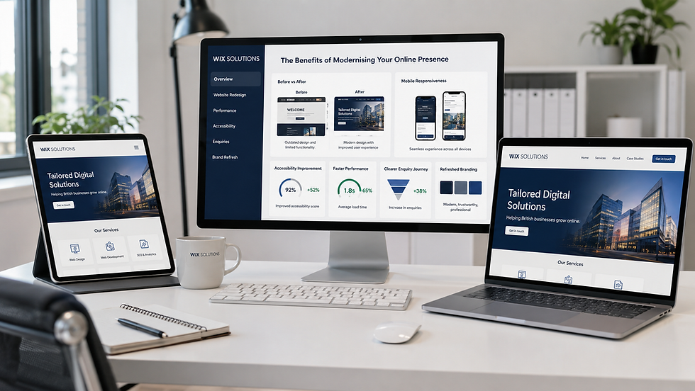
The Unseen Impact of Professional Website Design on UK Business Success

Professional website design affects far more than appearance. It influences how quickly people understand an offer, whether they trust the organisation, how easily they complete a task and how confidently staff can manage the digital operation behind the scenes. For a UK business, these effects can shape enquiry quality, service efficiency, customer loyalty and the ability to grow without creating avoidable friction.
The unseen impact appears in ordinary moments: a mobile visitor finds the correct service without calling; an accessible form prevents an abandoned enquiry; a prospective buyer downloads the right specification; a team member updates content without breaking the layout. Individually these moments seem small. Together they determine whether a website acts as a commercial asset or an expensive brochure.
Wix Solutions designs websites around these connected outcomes. Brand, user experience, content, search visibility, performance, accessibility, integrations and measurement are considered as one system, with the needs of the business owner and the customer kept in view.

How Professional Website Design Supports UK Business Success
Professional design supports UK business success by reducing uncertainty at every stage of the customer journey. A clear first impression helps a visitor decide that they are in the right place. Structured content answers the next question. Responsive layouts keep tasks usable on smaller screens. Accessible interactions widen participation. Reliable forms, bookings or payments turn interest into action. Analytics then show where the experience can improve.
This is not a claim that design alone creates growth. The offer, price, market, service quality and operational capacity remain fundamental. Website design makes those strengths easier to understand and use. It also exposes weaknesses: if a service cannot be explained clearly, a redesign may reveal that the offer or process needs work before additional traffic is useful.
The commercial effects that often remain unseen
1. Better qualification before a conversation
A carefully structured website helps visitors assess suitability before contacting the business. Service pages can explain who the offer is for, what the process involves, which locations are covered and what information is needed next. This can reduce unsuitable enquiries and give the team better context when a promising lead arrives.
2. Lower operational friction
Good design considers staff workflows as well as the public interface. A well-configured content system, clear form routing, useful automated confirmations and structured data can reduce copying, repeated questions and manual triage. The gain may appear as time saved rather than a dramatic marketing metric, but that time has real value.
3. Greater confidence and perceived competence
Visitors interpret consistency, clarity and attention to detail as signals. Accurate contact information, readable policies, current content, professional imagery and predictable navigation support credibility. Conversely, broken links, unclear ownership or a poor mobile layout can create doubt even when the underlying service is excellent.
4. Stronger accessibility and inclusion
Accessible design is both a responsibility and a practical quality standard. Heading structure, keyboard access, colour contrast, meaningful link text, labelled fields, alt text and readable layouts help people use the site in different circumstances. These choices also tend to improve clarity for everyone.
5. More resilient marketing
Campaigns work better when the destination matches the promise. A social post, advert or search result should lead to a page that continues the same message and provides the expected next step. Strong page architecture also allows a business to add new services or locations without rebuilding the whole site.
6. More dependable measurement
A professional build establishes events, form sources, consent handling and meaningful reporting. This makes it easier to distinguish traffic from progress. Owners can review which pages assist enquiries, where users hesitate and whether improvements affect commercially relevant behaviour.
Design the website as a business system
A business website sits between marketing and operations. It receives attention from search, social media, referrals and offline activity; it then organises that attention into information requests, bookings, purchases, applications or other tasks. The design should therefore reflect the real service process.
Define the priority audiences and the decisions each one must make.
Map content to discovery, evaluation, action and post-purchase support.
Create page templates that maintain consistency while allowing useful differences.
Connect forms, bookings, e-commerce, customer records and notifications deliberately.
Set accessibility and performance expectations before visual polish is approved.
Measure completion, quality and follow-up—not only sessions and clicks.
Give the internal team a safe, documented way to maintain the site.
If you are planning the structure of a new or revised site, Key Elements Every Successful Website Should Have provides a useful companion checklist.
Mobile design is not a smaller desktop
Many customer journeys begin on a phone, often while the user is distracted, travelling or comparing several options. Mobile design should prioritise the next decision rather than compress every desktop element. Navigation, tap targets, forms, content order, media size and page speed all require deliberate attention.
A responsive layout should preserve meaning as well as fit. A comparison that works in three columns may need a different sequence on a narrow screen. A contact choice that appears beside service information on desktop may need to follow it on mobile. Testing should use real tasks, not only screenshots at standard widths.
Search visibility begins with clarity
Search optimisation is strengthened by a website that has coherent page purposes, descriptive headings, internal links, useful content and sound technical foundations. Search engines need to understand the site, but the primary aim is to help people complete a relevant task. Creating many near-duplicate pages without distinct value can weaken the experience rather than improve it.
Local businesses should make service areas, address information, opening details and contact routes consistent. Specialist businesses need pages that explain expertise without hiding essential information behind jargon. Product and project businesses benefit from structured collections and filters that reflect how customers actually browse.
Illustrative case studies across five UK industries
The following case studies are fictional composites created to demonstrate design decisions. All business names, testimonials, charts, dashboards and performance figures shown in the graphics are illustrative; they are not Wix Solutions client results and should not be read as guarantees.
Case study 1: Veterinary practice
Situation: An independent veterinary practice had comprehensive services, but its website mixed routine care, emergency information and general contact details. Pet owners on mobile devices struggled to identify the correct route.
Design response: The new structure separated emergency help from appointment booking, grouped services by common need and used reassuring practitioner profiles. An accessible booking flow collected only necessary information and provided clear confirmation. Local information and opening details were made consistent across key pages.
What to assess: Appointment completion, emergency-path usage, missed appointments, common telephone queries, local page visits and feedback about clarity.

Case study 2: Construction and fit-out firm
Situation: A regional contractor had a strong project record, but its portfolio was difficult to filter and the general enquiry form did not collect the information needed to assess tenders.
Design response: Projects were organised by sector, service and location. Accreditation, safety and sustainability evidence appeared in relevant context. A tender enquiry path asked about project type, location, stage and timeframe, then routed the submission to the correct team without forcing every visitor through the same form.
What to assess: Qualified tender enquiries, portfolio-filter use, form completion, response time, unsuitable submissions and the project pages most often viewed before contact.

Case study 3: Independent coastal boutique hotel
Situation: A small hotel depended heavily on third-party booking channels. Its existing site conveyed atmosphere but made it difficult to compare rooms, understand accessibility or move confidently from inspiration to availability.
Design response: Room pages used consistent comparison information, honest photography and visible inclusion details. A direct-booking path retained the selected dates and room context. Local guides supported search discovery and helped guests plan a complete stay without distracting from the booking task.
What to assess: Direct-booking share, availability searches, room-page progression, booking abandonment, accessibility enquiries and the contribution of local guides.

Case study 4: Specialist legal practice
Situation: A legal practice offered several specialist services, but visitors could not easily judge which team handled their situation. The generic contact form produced incomplete enquiries and created time-consuming manual triage.
Design response: Service-led navigation used plain language and directed users to relevant solicitor profiles and guidance. The enquiry flow clearly stated that website information was not legal advice, asked proportionate routing questions and explained privacy. Downloadable resources supported informed consultations without promising outcomes.
What to assess: Qualified enquiries, correct service routing, guidance downloads, form abandonment, staff time spent on triage and accessibility of important information.

Case study 5: Bespoke furniture manufacturer
Situation: A British manufacturer attracted designers and private clients, but its site treated every visitor alike. Materials, specification files, project photography and trade enquiries were scattered across unrelated pages.
Design response: The new information architecture connected project galleries with a materials library and specification downloads. Trade visitors received a structured enquiry path, while private customers could explore craftsmanship and request samples. High-resolution photography was optimised so the visual experience remained fast.
What to assess: Specification downloads, sample requests, qualified trade enquiries, gallery filter use, image performance and progression from material or project pages to contact.

How to judge whether a redesign is working
A redesign should be evaluated against the original problem. If customers could not find a service, review navigation paths and related enquiries. If staff received incomplete forms, assess submission quality and triage time. If mobile users abandoned bookings, examine completion by device and test the task directly.
Compare appropriate periods and record external influences such as campaigns, seasonality, price changes or capacity constraints. A visual change and a commercial change may occur at the same time without one causing the other. Use analytics, user testing, staff observations and customer feedback together.
Businesses with an ageing or fragmented site may also find The Benefits of Modernizing Your Online Presence helpful when deciding whether to repair, redesign or rebuild.
A sensible professional website design process
Discovery: clarify business goals, audiences, risks, internal workflows and evidence of current problems.
Content and architecture: define page purposes, navigation, user journeys and content ownership.
Prototype: test structure and key tasks before investing in finished visuals.
Visual system: apply typography, colour, imagery and components consistently and accessibly.
Build and integration: configure responsive layouts, CMS collections, forms, bookings, e-commerce or other required systems.
Quality assurance: test content, links, forms, accessibility, devices, performance, analytics and legal information.
Launch and observation: monitor real use, repair issues quickly and compare outcomes with the original baseline.
Continuous improvement: schedule content reviews, technical maintenance and evidence-led iterations.
Frequently asked questions
What makes a website design professional?
Professional design is purposeful, consistent, accessible, responsive and technically reliable. It reflects the business accurately, helps defined audiences complete real tasks and can be maintained without unnecessary risk. Visual quality matters, but it is one part of the standard.
How often should a UK business redesign its website?
There is no fixed timetable. Review the site when the offer, audience, technology, brand or operational process changes, or when evidence shows that users are struggling. Smaller continuous improvements can sometimes solve the problem; a full redesign is appropriate when structure and systems no longer support the business.
Can a template still produce a professional website?
Yes. A well-chosen template can be an efficient foundation when it is adapted to the brand, content and user journey rather than filled mechanically. The important question is whether the result meets the business requirements, not whether every component was coded from nothing.
How should a business choose a website designer?
Look for a clear discovery process, relevant evidence, accessibility and performance awareness, transparent scope, realistic responsibilities and a plan for support after launch. The designer should be able to explain decisions in business and user terms, not only visual preferences.
Why choose Wix Solutions
Wix Solutions combines website strategy, UX and UI design, content structure, responsive implementation, integrations, search foundations and ongoing optimisation. We work with business owners to identify what the website must accomplish, then create a manageable system that supports customers and internal teams.
A strong website is part of a wider digital presence. Read Creating an Effective Online Presence for Your Business to see how the site connects with content, search, social channels and customer follow-up.
Bibliography
Krug, Steve. Don't Make Me Think, Revisited: A Common Sense Approach to Web Usability. 3rd edition. New Riders, 2014.
Norman, Don. The Design of Everyday Things. Revised and expanded edition. Basic Books, 2013.
Garrett, Jesse James. The Elements of User Experience: User-Centered Design for the Web and Beyond. 2nd edition. New Riders, 2010.
Kalbach, James. Mapping Experiences: A Complete Guide to Creating Value through Journeys, Blueprints, and Diagrams. 2nd edition. O'Reilly Media, 2020.
Lupton, Ellen. Thinking with Type. 3rd edition. Princeton Architectural Press, 2024.