Exploring the Fundamentals of Website Design

A business website is a working system: it helps people understand an offer, decide whether they trust it and complete a useful action. Colours and photography matter, but they only work when purpose, structure, content, usability and technology support one another. For UK business owners, learning these fundamentals makes it easier to brief a designer, judge proposals and invest in features that solve real customer problems.
This Wix Solutions guide explains the principles behind effective website design, shows how they change across five industries and provides a practical framework for planning, testing and improving a site. It does not treat design as decoration or promise identical results for every business.
Website Design Fundamentals for Business Owners
Strong website design begins with a defined job. A home page may need to introduce the business and direct visitors to the right service. A product page must explain value, answer objections and make purchasing clear. A contact or booking journey should collect only the information needed to take the next step.
When every page has a purpose, design decisions become easier to justify. A large headline is useful when it states the core proposition. A prominent button is useful when the action matches visitor intent. An animation is useful only when it communicates status or meaning without slowing or distracting the user.
The central principle: design the journey around evidence about users and the business, then use visual craft to make that journey clear, credible and memorable.
1. Purpose and User Needs
Begin with two questions: what does the visitor need to accomplish, and what does the business need to happen next? Interview customers, review enquiries, listen to sales or reception teams and examine site-search or analytics data. The GOV.UK Service Manual also advises teams to begin by learning about users and their needs, a useful discipline for commercial projects as well as public services.
Convert findings into a short list of prioritised journeys. A restaurant may prioritise viewing menus, booking and checking access information. A manufacturer may prioritise technical capability, quality standards and a relevant quotation. Trying to give every message equal weight produces clutter.
2. Information Architecture and Navigation
Information architecture decides how pages and content relate. Use language customers recognise rather than internal department names. Group related services, keep the main navigation concise and provide contextual links within the body. Important content should not depend on a visitor discovering a hidden interaction.
A useful structure often moves from broad orientation to specific evidence: home, service or product category, detailed page, proof and next action. Breadcrumbs, clear page titles and consistent menus help visitors understand where they are. The structure should also be manageable for the team that will maintain it.
3. Content Before Decoration
Design with real content early. Headings, prices, service limits, photographs, forms and legal information affect the layout; placeholder text hides those constraints. Draft each page around a primary question, then support it with evidence such as process, qualifications, specifications, testimonials or FAQs.
Plain English is usually stronger than inflated marketing language. Use short paragraphs, descriptive headings and labels that explain the action. A button reading “Book an assessment” is more informative than “Learn more” when that is the genuine next step.
4. Visual Hierarchy, Typography and Brand
Visual hierarchy shows what to notice first, second and third. Size, weight, spacing, contrast and placement should reinforce meaning. Limit heading levels, keep body text comfortably readable and use consistent components for repeated actions. Whitespace is not unused space; it separates ideas and reduces cognitive load.
Brand expression should feel recognisable without compromising clarity. A distinctive palette, photography direction and tone of voice can create memory, while a restrained component system keeps pages coherent. Contrast must remain sufficient when brand colours are used for text, controls or status.
5. Responsive Behaviour
Responsive design is not merely shrinking a desktop composition. Content may need to reflow, navigation may change form and complex tables may require a mobile alternative. Test common and narrow widths, landscape orientation, text enlargement and real touch interaction.
Google uses the mobile version of a site for indexing, so primary content, meaningful alternative text and structured information should remain equivalent across devices. A desktop-only feature is a business risk when customers need it on a phone.
6. Accessibility by Design
Accessibility belongs in planning, design, content and testing. The current W3C Recommendation, WCAG 2.2, organises guidance around content that is perceivable, operable, understandable and robust. Practical checks include keyboard access, visible focus, text alternatives, sufficient contrast, descriptive labels, understandable errors and controls with suitable target sizes.
Automated tools can find some problems, but they cannot judge every user experience. Combine scans with keyboard testing, screen-reader checks and human review. Accessibility also benefits people dealing with glare, injury, slow connections, small screens or unfamiliar language.
7. Performance and Technical Quality
Performance is part of the experience. Optimise image dimensions and formats, avoid loading unnecessary scripts, limit heavy video and test complete templates rather than an empty home page. Stable layouts prevent controls moving as the page loads. Fast feedback on forms reassures visitors that an action has worked.
Technical quality also includes secure delivery, crawlable links, useful error pages, accurate metadata and structured data that matches visible content. These foundations support discovery and trust, but they do not replace useful content.
8. Conversion Without Pressure
A conversion is any meaningful next step: a purchase, booking, quotation, visit, referral or download. Place actions where the visitor has enough information to choose, explain what happens afterwards and remove unnecessary fields. Use reassurance where it answers a real concern, not as decoration.
Avoid manipulative urgency, pre-selected consent or confusing button labels. Ethical conversion design builds confidence and usually produces better-quality enquiries because expectations are clear.
Five Illustrative Website Design Case Studies
The following are fictional Wix Solutions planning scenarios. All business names, people, interfaces, testimonials, charts, metrics and outcomes in the images are illustrative and are not real client claims or guaranteed results.
Case Study 1: Artisan Bakery
An artisan bakery needs warmth and appetite appeal, but its most common customer tasks may be practical: checking opening times, finding allergens and pre-ordering a loaf before it sells out. The proposed site would place location, hours and pre-ordering high in the hierarchy while using photography to communicate craft.
Wix Solutions would map the mobile order journey from product selection to collection slot and confirmation. Products would have consistent names, prices, ingredients and availability. Brand colours would be tested for contrast, and the bakery team would receive reusable product and journal templates so daily updates do not break the layout.
Measurement would separate ordinary visits, completed pre-orders and abandoned steps. If customers frequently exit at collection selection, the team would investigate availability wording or interface friction rather than simply adding another promotional banner.

Case Study 2: Independent Financial Adviser
A financial-advice website must communicate scope and trust without implying certainty or hiding important qualifications. Visitors may arrive with different needs, so information architecture should distinguish retirement, investment and planning services while giving a clear route to an introductory consultation.
The design would use calm typography, straightforward explanations and visible regulatory information that the adviser has verified. Booking would explain whether the meeting is free, what information is collected and what happens next. Forms dealing with personal data would request only what is necessary at the first stage.
Success would be judged by suitable consultation bookings and fewer confused enquiries, not by making the loudest claims. Compliance content must be reviewed by the authorised business; Wix Solutions would design the structure but not invent regulated statements.

Case Study 3: Veterinary Physiotherapy Clinic
A veterinary physiotherapy clinic serves pet owners and referring veterinary professionals. The website must explain the service responsibly, make referral requirements clear and help owners prepare for an appointment without presenting generic information as medical advice.
Wix Solutions would create pathways for conditions treated, services, referrals, first visits and booking. Content would be written or approved by qualified clinicians. Photographs would show realistic care, alternative text would describe their informational purpose and forms would avoid collecting sensitive detail that is unnecessary before contact.
Mobile testing would focus on booking, directions and urgent clarification. No website should imply that online content replaces veterinary assessment; that boundary would be visible throughout the journey.

Case Study 4: B2B Engineering Manufacturer
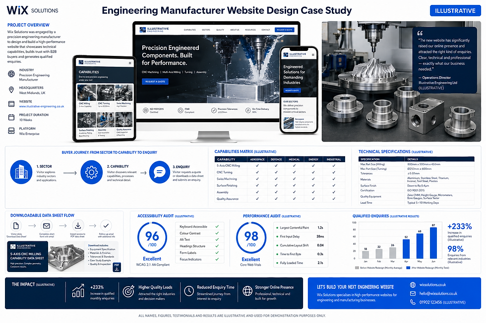
A precision manufacturer needs a different hierarchy from a consumer brand. Engineers and procurement teams may require capabilities, tolerances, materials, quality standards, sectors and downloadable data before they are ready to enquire.
The site would organise content from sector to capability to specification and quotation. Reusable data fields would keep technical values consistent across pages. Data-sheet downloads would remain accessible and useful, while essential information would also appear in HTML so it can be read on mobile and maintained centrally.
The main conversion would be a qualified enquiry that identifies the relevant process or component. Measurement would examine enquiry relevance and time saved for sales engineers, not just total form submissions.
Case Study 5: Children’s Theatre School
Parents choosing a theatre school need class suitability, location, timetable, price, safeguarding information and a clear way to book a trial. Young performers may also browse the site, so language and imagery should be welcoming without obscuring responsibilities.
The design would include a class finder filtered by age, interest, location and time; a readable timetable; parent FAQs; and a visible safeguarding route. Image consent would be treated as an operational workflow, not assumed because a photograph is attractive. The school must control approved media and withdrawal requests.
Wix Solutions would test the full journey with parents using phones. Trial bookings, timetable views and common questions would inform improvements, while all safeguarding statements would be owned and verified by the school.

A Practical Website Design Process
Define business outcomes and prioritised user journeys.
Audit existing content, analytics, enquiries and operational constraints.
Create the sitemap and page purposes before polishing visual concepts.
Draft real content and choose evidence for each page.
Build wireframes that show hierarchy, navigation and conversion paths.
Apply the brand system through typography, colour, imagery and components.
Build responsive templates and connect repeatable content to Wix CMS where useful.
Test accessibility, performance, forms, booking, ecommerce and error states.
Review the site with stakeholders who own legal, medical, financial or safeguarding content.
Launch with measurement in place, then improve from evidence.
A process should be proportionate. A small service business may need a concise site and a handful of tested journeys; a multilingual or regulated organisation needs deeper governance. The fundamentals stay the same even when the scale changes.
How to Evaluate a Website Design Proposal
Does it explain the customer problem and business objective?
Is the proposed page structure clear before visual styling begins?
Who writes, approves and maintains the content?
How will mobile, accessibility and performance be tested?
Which features are essential now, and which can wait?
How are forms, bookings, payments or CMS workflows supported after launch?
Which outcomes will be measured, and how will improvements be prioritised?
A strong proposal makes trade-offs visible. It should not hide ongoing costs, content responsibilities or technical dependencies behind an attractive home-page mock-up.
Related Wix Solutions Guides
Continue with Creating User-Friendly Websites for Better Engagement for a deeper usability perspective. If you are planning a rebuild, read Website Design Impacts Search Rankings to understand migration risks. You can also use Key Elements Every Successful Website Should Have as a practical feature checklist.
Frequently Asked Questions
What is the first step in website design?
Define the site’s purpose and the priority needs of its users. Do this before choosing colours or layouts. Clear journeys give the design a reason and make later decisions easier to test.
How many pages does a small business website need?
There is no universal number. Use enough pages to explain distinct services, evidence and customer questions without creating thin repetition. A focused five-page site can outperform a sprawling site if it answers the right needs clearly.
Should a website be designed mobile-first?
Mobile-first planning is useful because it forces prioritisation, but the finished website must work across device sizes and input methods. Test real content and functionality on phones, tablets and desktops rather than assuming one composition simply scales.
Can a template still follow good design fundamentals?
Yes. A suitable template can provide a sound starting system, particularly for smaller budgets. It still needs real content, accessible brand choices, responsive testing and adaptation to the business journey. A template is a framework, not a complete strategy.
Bibliography
Don't Make Me Think, Revisited: A Common Sense Approach to Web Usability, 3rd edition — Steve Krug.
The Design of Everyday Things, revised and expanded edition — Don Norman.
Information Architecture for the Web and Beyond, 4th edition — Louis Rosenfeld, Peter Morville and Jorge Arango.
Designing with Web Standards, 3rd edition — Jeffrey Zeldman and Ethan Marcotte.
Responsive Web Design, 1st edition — Ethan Marcotte.
Content Strategy for the Web, 2nd edition — Kristina Halvorson and Melissa Rach.
Standards and Technical References
This guide also refers to the Web Content Accessibility Guidelines (WCAG) 2.2, the GOV.UK Service Manual guidance on learning about users and their needs and Google Search Central’s mobile-first indexing best practices.
Wix Solutions helps UK businesses turn these fundamentals into clear, maintainable Wix and Wix Studio websites. The best starting point is a practical conversation about customers, content, operations and the outcomes the site must support.