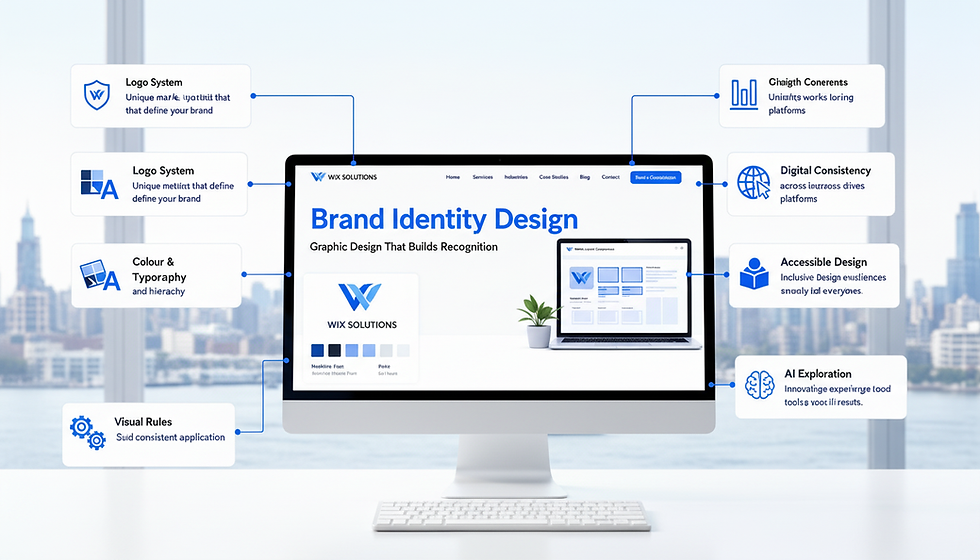
Graphic Design: Turn Web Services into a Coherent Visual System

Graphic design becomes most valuable when nobody needs to reinvent it. A service page, case study, social campaign and proposal can feel related because the team is using one visual language with clear rules—not because every asset repeats the same layout.
Graphic Design is therefore infrastructure for web services. It creates hierarchy, recognition and explanation across components, pages and campaigns. It helps a visitor see what matters, understand relationships and identify the next step.
These studio notes move from visual strategy to production. The goal is a system that works in Wix or Wix Studio after the launch files leave the designer’s screen.

Graphic Design turns strategy into visible decisions
Begin with the business message and customer task. If the brand wants to communicate precision, the visual system needs more than a dark blue palette; it needs disciplined spacing, clear diagrams, controlled evidence and consistent data treatment. If the offer depends on warmth and local craft, real materials, human scale and tactile detail may matter more than decorative illustration.
Define three to five visual principles that can guide decisions. “Clear before clever” might prioritise legibility and explanation. “Evidence has a shape” might standardise how outcomes, specifications and process diagrams appear. “One voice, many formats” might allow campaign variation while preserving typography, colour and image direction.
Our Business Graphics Design service creates practical assets for websites and marketing. Where the wider identity needs work, connect it with Branding & Visual Identity.
Build hierarchy before decoration
A visual hierarchy should reveal page purpose, grouping and action. Size, weight, contrast, position, spacing and repetition are signals. When every heading, card and button competes at the same intensity, the page becomes visually loud but informationally flat.
Start in monochrome. If the layout still communicates importance and relationship without brand colour, the hierarchy is doing real work. Then add colour to encode meaning, state or recognition—not to rescue a weak structure.
Primary signal: the page proposition, decision or action that must be recognised first.
Supporting structure: headings, groups and comparisons that help the visitor scan.
Evidence layer: images, diagrams, numbers, quotations and specifications that substantiate claims.
Interaction layer: links, buttons, controls, feedback and states that reveal what can happen.
Atmosphere layer: colour, texture, illustration and motion that shape feeling without obscuring function.
For the relationship between visual structure and page purpose, review the website design glossary.
Create an asset system, not an asset pile
List every recurring visual need: service hero, process diagram, case-study evidence, quotation, statistic, team profile, product comparison, campaign banner, social card, download cover and email header. Group needs by function, then decide which should become responsive components and which should remain exported assets.
A responsive website component should hold live text when the information must be readable, selectable, translatable or updated. An exported graphic is suitable when visual composition is the message and a meaningful text alternative can be provided. Avoid turning essential paragraphs into images.
Document dimensions, safe areas, crops, focal points, formats, colour use and naming. A simple production guide prevents a future editor placing a portrait photograph into a wide banner or exporting every icon at a different weight.
A visual-system matrix
Asset | Customer job | Design rule | Quality check |
Service hero | Create orientation | One proposition, relevant image, clear action | Meaning survives the mobile crop |
Process diagram | Explain sequence | Numbered stages with live supporting text | Order works with zoom and screen readers |
Case evidence | Make a claim inspectable | Caption, context and consistent result treatment | Source and timeframe are clear |
Campaign graphic | Earn recognition | Shared type, colour and image direction | Message matches the landing page |
Icon set | Support scanning | One stroke, grid and metaphor system | Icons are labelled where meaning is not obvious |
Use images as evidence or atmosphere—know which
An image can demonstrate a product, reveal scale, document work, introduce people or set emotional context. Name its job before choosing it. If the image is evidence, accuracy and captioning matter. If it is atmosphere, it should support the message without pretending to prove a claim.
Develop an image direction that covers subject, light, angle, colour, background, crop and treatment. This produces recognition beyond a filter. Avoid mixed stock styles that make one brand look like several businesses.
Optimise files for their displayed size, provide purposeful alternative text and protect focal points across viewports. The Wix Image Settings guide and our Image Editing & Website Visuals service support the production details.
Design diagrams that explain, not impress
Services are often intangible. A diagram can make sequence, responsibility, comparison, system or outcome visible. Begin with the sentence the diagram must prove. Choose the smallest visual grammar that can carry it: steps for sequence, lanes for responsibility, layers for hierarchy, nodes for relationships or a matrix for comparison.
Remove decoration that does not change understanding. Label relationships directly; do not make readers decode a legend unnecessarily. Use colour consistently and never as the only carrier of meaning. Provide a text explanation for people who cannot access the visual.
A good diagram should help sales and delivery as well as the website. If teams explain the process differently in every meeting, the visual system has identified a strategic inconsistency.
Make icons and illustration coherent
Icons work best as a supporting language. Define grid, stroke, corner, fill, perspective and metaphor style. Do not combine outlined technical symbols, glossy emojis and hand-drawn illustrations in one service sequence unless the contrast has a reason.
Familiar icons can aid scanning, but ambiguous icons need labels. A star might mean favourite, quality or featured; a lightning symbol might mean speed, energy or automation. Clarity is not reduced by a short word.
Illustration can give a brand distinctive intellectual property and explain situations photography cannot show. Build a small world of shapes, people, objects and environments that can extend without becoming a new art direction every month.
Connect website graphics with campaigns
A social advert and landing page should feel like two stages of one experience. Continue the central image, promise, colour logic and action. If the campaign earns attention with one message and the website opens with another, visual consistency cannot repair the break.
Create campaign kits from the core system: source file, channel variants, safe areas, image options, accessible copy, naming and the intended destination. Measure which proposition and evidence work; do not treat decoration as the variable when the message changed too.
For a connected approach, combine Social Media Branding & Marketing with focused landing-page guidance.
Three illustrative graphic-design cases
These composite cases demonstrate visual-system decisions. They are not claims about named clients or invented commercial results.
Case study 1: a consulting firm with invisible expertise
The firm’s site relied on office photographs and abstract shapes, while its real value was a rigorous diagnostic method. The redesign turned the method into a reusable four-stage diagram, standardised decision criteria and gave case studies a consistent evidence format.
The graphics appeared on service pages, proposals and workshop materials. The lesson: graphic design created value by making expertise inspectable, not by adding more decoration.
Case study 2: a specialist product retailer
Product images came from several suppliers with inconsistent backgrounds, scale and crops. Comparison pages looked unreliable even though the data was accurate. The team defined photography treatment, crop ratios, icon rules and specification graphics.
Live text remained outside the images, and every asset had an accessible naming and alternative-text workflow. The lesson: visual consistency can improve comparison confidence when it is connected to product operations.
Case study 3: a membership campaign
The organisation produced a new visual style for every event, so members did not recognise the programme series. A modular campaign kit introduced one typographic hierarchy, flexible colour families, speaker treatment and mobile-safe templates.
Each campaign retained personality while the organisation became recognisable. The lesson: a system creates freedom by limiting the decisions that do not need to be made again.
Continue with The Role of Graphic Design in Brand Identity, The Role of Visuals in Successful Websites and The Role of Visuals in Effective Web Development. Browse our case studies for applied examples.
Graphic Design asset checklist
Every recurring asset has a named customer or editorial job.
Hierarchy works in monochrome before decorative colour is added.
Typography, colour, spacing, icons, imagery and data graphics follow documented rules.
Essential information remains live text where it must be read, translated or updated.
Images have defined crops, focal points, formats, filenames and alternatives.
Diagrams state one purpose and include a text equivalent.
Icons share one construction system and ambiguous symbols have labels.
Campaign assets continue the promise and visual logic of the landing page.
Source files, licences, owners and review dates are recorded.
New assets are tested on real mobile and desktop layouts before publication.
Questions and answers
Is graphic design the same as branding?
No. Branding is the wider system of meaning, position and experience. Graphic design makes part of that system visible through typography, colour, imagery, layout, icons and other assets.
Should website text be placed inside graphics?
Only when composition requires it and a useful text alternative exists. Essential service information, headings and actions should normally remain live text for accessibility, responsiveness, search and editing.
How many fonts should a website use?
Use the smallest set that creates the necessary hierarchy and brand character. One family with several weights can be enough; two complementary families are common. Consistency and performance matter more than a universal number.
Do custom icons improve a website?
They can strengthen coherence and distinction when the interface needs them. Custom icons are not valuable if their meaning is unclear or if familiar symbols would be easier to understand.
Can AI-generated images be used commercially?
Businesses must review the terms, licences, accuracy, originality, consent, brand fit and potential rights issues for the tools and uses involved. Human review remains essential; this article is not legal advice.
How often should a visual system be updated?
Update when the business position, audience, channels or production needs change, or when repeated exceptions reveal a missing rule. Do not redesign merely because a trend has changed.
Design the system once; improve it through use
Graphic design makes a web service easier to recognise, understand and maintain when it is tied to decisions. The strongest result is not a folder of polished files; it is a visual language that keeps working.
If your Wix website needs coherent graphics, diagrams, imagery or campaign assets, contact Wix Solutions. We can build a practical system that supports real pages and future content.
Bibliography
Lupton, Ellen. Thinking with Type. 3rd edition, 2024.
Samara, Timothy. Design Elements: A Graphic Style Manual. 2nd edition, 2014.
Wheeler, Alina. Designing Brand Identity: An Essential Guide for the Whole Branding Team. 5th edition, 2017.
Lidwell, William; Holden, Kritina; and Butler, Jill. Universal Principles of Design. 3rd edition, 2023.