
Brand Identity Design: The Role of Graphic Design in Business Growth

Brand identity design is the visual translation of a business strategy. It takes an organisation’s positioning, personality, audience and promise and turns them into a system people can recognise. A logo is part of that system, but effective identity goes much further: colour, typography, imagery, iconography, layout, motion, tone and digital behaviour all contribute to how a brand feels in practice.
For a business website, this matters because visual decisions influence clarity before a visitor reads every word. The strongest identities make content easier to navigate, make services easier to distinguish and create a consistent experience across the website, marketing and social channels. Good graphic design supports meaning; it does not compete with it.
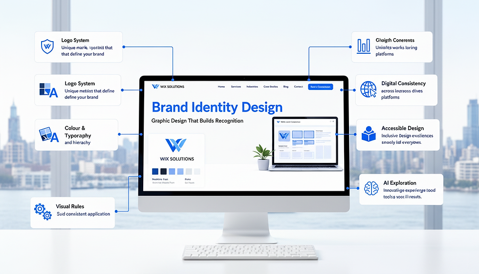
How Brand Identity Design Creates Recognition
Recognition comes from repeated patterns. When the same typography hierarchy, colour logic, image treatment and layout principles appear on a website, proposal, social graphic and presentation, the audience has fewer new visual rules to learn. Over time, those patterns become shortcuts: people can identify the brand before they see the full logo or company name.
This consistency also supports a stronger social media presence because each post can vary in subject while still feeling unmistakably connected to the website. The goal is not rigid sameness; it is controlled variation inside an established system.
The Core Components of a Useful Visual Identity
Brand Identity Design Example: Start with the Logo System
A professional logo system should include more than one perfect horizontal version. Think about the practical environments in which the mark will appear: website header, mobile menu, social avatar, favicon, email footer, printed document and dark or light background. Primary, secondary and simplified versions give the brand flexibility without encouraging improvised alternatives.
Use Colour with Purpose, Not Decoration
Choose a small working palette with defined roles. One colour may carry the strongest brand recognition, another can support calls to action, while neutral colours control backgrounds, borders and readable text. The palette should work in real interfaces, not only in a presentation board. Check contrast and readability so brand expression does not create accessibility problems.
Build a Typography Hierarchy
Typography should help visitors understand information quickly. Define heading levels, body copy, labels, buttons, captions and any display style separately. A distinctive typeface can add personality, but body text still needs to remain comfortable to read. On a website, scale and spacing matter as much as the font choice itself.
Create Rules for Imagery, Icons and Layout
Decide what kind of photography, illustration, iconography and graphic shapes belong to the brand. Then define how much visual density is appropriate, how sections are spaced and how information is grouped. These rules are especially valuable when several people create content because they reduce subjective decisions and make future production faster.
Four Practical Brand Identity Examples
Example 1: Professional Services Firm
A law, finance or consultancy business may need a calm, assured identity rather than a visually loud one. A restrained palette, strong typography, consistent document templates and confident photography can communicate credibility. The website should use the same hierarchy in service pages, insights and enquiry routes so the identity supports trust rather than simply looking expensive.
Example 2: Café or Hospitality Brand
A hospitality brand can use warmer colour, more expressive photography and a recognisable graphic motif across menus, signage, social posts and its website. Consistency matters because the digital experience sets an expectation for the physical one. Booking information, menus and location details still need clarity even when the visual character is playful.
Example 3: B2B Software or Technology Company
A technology company may need a system that can explain complex ideas simply. Diagram styles, product screenshots, icon families and colour-coded feature groups can become part of the identity. The visual system should make product information easier to scan and should scale from a sales deck to a responsive website without losing its logic.
Example 4: E-Commerce Brand
An online retailer needs an identity that supports product photography rather than overwhelms it. Packaging, collection graphics, product labels, campaign assets and checkout messaging should feel connected. A clear visual system also makes future professional website design easier because designers can work from established rules instead of reinventing the brand on each page.
Where AI Tools Fit into Brand Identity Work
AI can be useful during exploration and production. Writing tools can help organise discovery notes, compare positioning statements or turn an approved brief into content prompts. AI-enabled image and design tools can help explore moodboard directions, composition ideas or alternative visual treatments. They can also speed repetitive tasks such as generating draft variations for review.
They should not replace brand judgement. A final identity needs deliberate decisions about originality, rights, accessibility, differentiation and real-world use. AI outputs can converge on familiar visual patterns, so human art direction is important if a brand is meant to look distinctive. Use AI to widen exploration or accelerate approved production—not to outsource the strategic core of the identity.
Turn the Identity into a Working Brand Guide
A useful brand guide shows examples, not only specifications. Include logo variations and safe space, colour values, typography hierarchy, button styles, image direction, icon rules, social templates and examples of correct and incorrect use. For digital teams, include responsive considerations so mobile layouts do not become a visually different brand.
The guide should also connect visual identity to messaging. If the business is improving its wider online brand presence, design and content need to tell the same story. A premium colour palette cannot compensate for vague positioning, just as strong copy cannot fully compensate for inconsistent presentation.
Brand Identity Design Should Make Growth Easier
The commercial value of a well-built identity is repeatability. New pages, campaigns, presentations and social assets can be created faster because the fundamental design decisions already exist. Teams gain a shared reference, customers experience less visual inconsistency and the business can expand without weakening recognition at every new touchpoint.
Wix Solutions combines branding, website design, content and SEO so identity decisions can be applied where customers actually experience them. Explore Wix Solutions services for support turning a visual identity into a coherent business website and wider digital presence.


