The Essentials of Effective Graphic Design

Graphic design helps a business make information visible, understandable and memorable. It is not decoration added after the message is written. Typography, colour, imagery, spacing and composition determine what people notice first, how they interpret the content and whether the communication feels trustworthy.
For business owners, effective design creates a consistent system across websites, social posts, proposals, packaging, signs and printed materials. The aim is not to make every item identical; it is to make every item recognisably part of the same organisation and appropriate for its task.
Effective graphic design starts with purpose
Before choosing a font or colour, define the communication problem. Who needs to understand the message? What do they already know? What should they notice, feel or do next? A design can look polished and still fail if it gives the wrong information priority.
Audience: the people the design must serve, including their context and accessibility needs.
Message: the single most important idea and the evidence that supports it.
Action: what the viewer should do after understanding the message.
Format: where the design will appear, at what size and under what viewing conditions.
Constraints: brand rules, production budget, legal requirements, image rights and deadlines.
Measurement: the behaviour or understanding that will indicate whether the design works.
For more on the commercial role of visual communication, read How Visuals Influence Consumer Choices and The Importance of Visual Branding in Today's Market.
1. Visual hierarchy
Hierarchy tells viewers what to read first, second and third. Size is one tool, but position, contrast, weight, colour and spacing also establish priority. A clear headline, supporting explanation and primary action should not compete at the same visual volume.
Test hierarchy by viewing the design at a distance or as a small thumbnail. If the intended message disappears, the composition may rely on detail rather than structure. A good design remains understandable before every word is read.
2. Typography
Typography gives language a visible voice. Select typefaces that support the brand’s character and remain readable in the intended formats. Most business systems need fewer fonts than teams expect: a strong family with suitable weights can often handle headings, body copy, captions and labels.
Use a deliberate scale between heading levels.
Keep body text comfortably readable and avoid excessively long lines.
Use weight and spacing before adding many colours or typefaces.
Check numerals, punctuation, currency symbols and special characters.
Do not use capital letters for long passages.
Test the actual words; a type sample cannot reveal every line-break problem.
Typography must also survive production. A delicate display font may work on a large poster but fail on packaging, signage or a small mobile screen. Define approved alternatives and minimum sizes in the brand guidance.
3. Colour and contrast
Colour can create recognition, separate information and support mood, but it should not carry meaning alone. Define a primary palette, supporting colours and functional colours for states such as success, warning and error. Record digital and print values so reproduction is more consistent.
Check text contrast and test designs without colour cues. Charts, forms and diagrams need labels or patterns as well as colour differences. Cultural associations vary, so context and audience research matter more than a universal list of colour meanings.
4. Space, alignment and grid
White space is active structure, not wasted area. It separates ideas, creates rhythm and makes important content easier to recognise. Alignment provides relationships between elements, while a grid gives repeated formats a reliable framework.
Use the grid as a decision tool rather than a cage. A purposeful break from alignment can create emphasis, but many accidental breaks make the design feel unstructured. Consistent margins and spacing are particularly important in multi-page documents and responsive interfaces.
5. Contrast, balance and repetition
Contrast distinguishes different levels or functions. Balance distributes visual weight; it does not require perfect symmetry. Repetition connects pages and formats through shared typography, colour, shapes, image treatment and spacing.
These principles work together. Repetition without hierarchy becomes monotonous, while contrast without repetition feels fragmented. Effective systems provide enough consistency for recognition and enough variation to suit the content.
6. Imagery and art direction
Photography, illustration and iconography should share an intentional visual language. Define subject matter, lighting, composition, background, cropping and editing style. A random collection of individually attractive images can weaken brand recognition.
Use images you have the right to publish. Keep source, licence and consent records, and avoid implying that stock models are employees or customers. On websites, protect important subjects with appropriate focal points and alternative text while keeping file sizes proportionate.
7. Brand consistency across touchpoints
A logo is only one part of a visual identity. A useful system explains how typography, colours, image style, composition, icons, data visualisation and voice work together. It also shows common applications so staff and suppliers can make good decisions without copying one layout.
Templates are helpful for repeated social posts, presentations, proposals and campaign materials, but they need content limits. Define what may change, what must remain consistent and who approves exceptions.
8. Design for the medium
A social post, website hero, brochure and shop sign are viewed differently. Design from the medium’s constraints rather than simply resizing one artwork. A message that works on an A4 page may need to become a shorter headline, clearer image and separate caption on a phone.
Check safe areas, bleed, trim and colour settings for print.
Test legibility at the real viewing size and distance.
Use responsive compositions for different digital aspect ratios.
Provide accessible text outside images where possible.
Export the correct file type and sufficient resolution.
Keep an editable source and an approved final version.
9. Accessibility and inclusive design
Accessible graphic design benefits more people and usually improves clarity. Use readable type, sufficient contrast, plain language and logical order. Do not place essential information only inside a complex image; provide a text equivalent for digital content.
Consider people with colour-vision differences, low vision, cognitive disabilities and motor limitations. Avoid unnecessary flashing or motion, give controls visible focus states and make charts understandable without relying on colour alone.
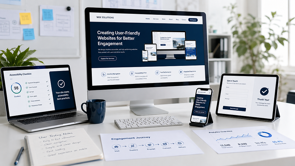
The same principles support stronger digital journeys in Creating User-Friendly Websites for Better Engagement.
10. Review, test and govern
Design review should compare the work with the brief, not with personal taste. Ask whether the hierarchy is clear, the message is accurate, the brand system is followed and the format works in context. Test with representative users when the communication affects an important decision.
Content review for accuracy, claims, dates and spelling.
Brand review for logo use, typography, colours and image style.
Accessibility review for contrast, text size, reading order and alternatives.
Technical review for dimensions, resolution, exports and links.
Production proof for print or physical applications.
Named approval, version number and future review date.
A simple asset library prevents staff from using outdated logos and unapproved templates. Organise files by purpose, record ownership and archive replaced versions rather than leaving duplicates with vague names.
Five illustrative design case studies
The following fictional examples show how the same principles lead to different visual systems. All names, people, testimonials, charts, figures and outcomes in the visuals are illustrative; they demonstrate planning possibilities and are not claims about real Wix Solutions clients.
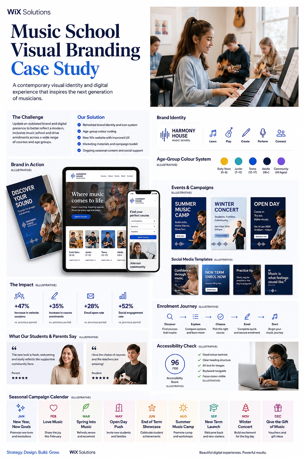
1. Music school: one identity for different age groups
A music school serves young children, teenagers, adults and families. The design system needs enough energy to feel creative without becoming childish for older learners. A shared logo, clear typography and an age-group colour system create recognition across course pages, posters, social templates and event campaigns.
The hierarchy keeps the course type, age range, date and action easy to scan. Photography focuses on genuine learning activity rather than generic performance imagery. Templates define safe areas and copy limits so staff can create seasonal campaigns without weakening the identity.
2. Architecture practice: aligning proposals and digital presence
An architecture practice communicates through project imagery, technical drawings, proposals and presentations. The identity must support the work rather than compete with it. A restrained palette, consistent grid and disciplined typography create a calm frame for different project sectors.
Proposal covers, drawing sets, signage and the website use related rules but different layouts. Sector colour coding helps navigation without replacing written labels. A consistency checklist gives the team a practical way to review documents before they reach a client.

3. Boutique hotel: translating place into a useful identity
A coastal boutique hotel needs a visual identity that expresses location and atmosphere while keeping booking information practical. The colour palette draws from sea, sky, stone and sand, but room types, prices and availability remain the primary content in the booking journey.
Art direction defines natural light, coastal context and realistic room photography. The website, printed guest information and campaign materials share the same tone without covering every surface in decorative motifs. Accessibility and legibility remain essential for room comparisons and calls to action.

4. Farm shop: making local produce easy to recognise
A farm shop combines e-commerce, collection, local delivery, recipes and in-store communication. The visual system uses honest produce photography, a practical typographic hierarchy and a small set of colours that reproduce well on signs, labels and screens.
Product cards prioritise name, weight, price and stock. Delivery maps and allergen information use labels rather than colour alone. Recipe content connects the brand’s local story to useful customer guidance, while templates keep seasonal promotions recognisable.

5. Craft brewery: recognition from shelf to taproom
A craft brewery needs packaging that distinguishes individual products while keeping the parent brand obvious. A flexible label architecture reserves consistent areas for the logo, beer name, style, strength and mandatory information, then uses colour and illustration for variation.
The same typography and coastal visual language extend to taproom signage, merchandise, the website and social posts. Shelf tests check recognition at a distance, while a consistency checklist prevents packaging, digital and in-person experiences from drifting apart.

What the five systems demonstrate
The strongest identities are not built from a single mood board. They connect business context to repeatable design decisions. A music school needs audience flexibility; an architect needs disciplined presentation; a hotel needs place-led art direction; a farm shop needs clear practical information; a brewery needs product variation inside one recognisable family.
Wix Solutions develops visual systems alongside websites and digital content so the brand works in real customer journeys. The work includes rules, templates and governance—not only final artwork.
A practical design brief for Wix Solutions
A useful brief does not need to prescribe the finished design. It should provide the information needed to make good decisions:
business objectives and priority audiences;
the main message and actions for each touchpoint;
existing brand assets and known problems;
required formats, dimensions, production methods and deadlines;
competitors and category conventions to understand or challenge;
photography, illustration and licensing requirements;
accessibility, legal and approval requirements;
the people who will maintain templates and approve work.
For guidance on applying visuals in campaigns, continue with The Role of Visuals in Modern Digital Marketing.
Frequently asked questions
What makes graphic design effective?
Effective design helps the intended audience understand the right message and complete the intended action. It combines purpose, hierarchy, typography, colour, imagery, spacing, accessibility and technical production into one coherent solution.
How many fonts should a brand use?
There is no fixed number, but most small businesses need a limited, well-defined set. One versatile family or a carefully chosen pair can cover headings, body text and supporting information while keeping the identity consistent.
Is a logo the same as a brand identity?
No. A logo is one identifier. A visual identity also includes typography, colour, imagery, layout, icons, data visualisation and application rules. The broader brand includes positioning, experience, language and behaviour.
How often should brand guidelines be reviewed?
Review them when the business changes, new channels are introduced or teams repeatedly face decisions the guidance does not answer. A light annual review can identify outdated assets, missing formats and accessibility improvements.
Conclusion
Effective graphic design turns business intent into a clear visual system. It gives information priority, creates recognition and helps teams communicate consistently across digital and physical touchpoints.
Start with the audience and message, build a usable hierarchy, test the real format and document the decisions others must repeat. Wix Solutions can bring these elements together in a visual identity and website system designed for everyday business use.
Bibliography
Lupton, Ellen. Thinking with Type: A Critical Guide for Designers, Writers, Editors, and Students, 2nd revised and expanded edition.
Wheeler, Alina. Designing Brand Identity: An Essential Guide for the Whole Branding Team, 5th edition.
Müller-Brockmann, Josef. Grid Systems in Graphic Design, 1st edition.
Lidwell, William; Holden, Kritina; Butler, Jill. Universal Principles of Design, Revised and Updated, 3rd edition.
Williams, Robin. The Non-Designer’s Design Book, 4th edition.