Visual Identity Law Firm – Example of Project
This example project shows how Wix Solutions can develop a complete visual identity for a law firm, creating a refined, professional and highly consistent brand image across digital and printed materials. In the legal sector, presentation matters greatly. A law firm must communicate trust, structure, seriousness, discretion and authority. That means branding cannot be treated as only a logo or a website. It needs to become a full identity system that supports the firm in every place where clients, business partners and potential cases meet the brand.
In this project, the work was built around the creation of a premium and credible legal brand that could be used consistently across the firm’s website, office materials, client-facing documents, printed assets and visual communication. The goal was to ensure that the law firm looked established, organised and reliable from the very first impression.
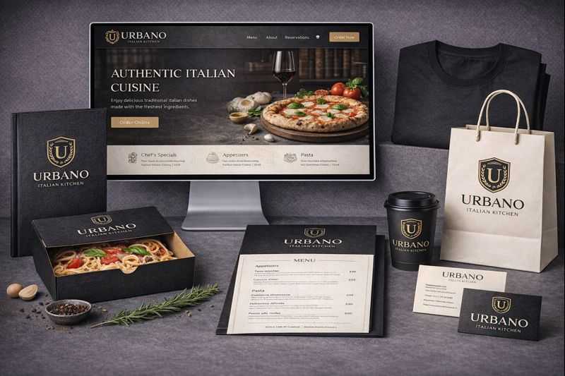
At the image of the project, you can clearly see that the branding was designed as a complete legal business identity, not just a single graphic task. The project includes a professionally designed website, a branded office mug, official letterhead and document templates, business cards, a presentation folder, a shopping or client gift bag, a brochure or booklet, consultation materials and other printed office assets. Together, these items create one coherent visual system, which is exactly what a law firm needs if it wants to present itself at a high professional level.
The visual identity is based on a dark, elegant and serious colour palette, supported by gold or warm metallic-style accents. This is particularly suitable for the legal industry because such colours help express authority, prestige, confidence and professionalism. The choice of colours is very important in law firm branding. Bright or casual colours may weaken the impression of seriousness, whereas deeper tones with refined accents help create a stronger image of trust and competence.
A central part of the project was the development of the logo and core brand mark. For a law firm, the logo should feel timeless, stable and sophisticated. It must work well across formal documents, website headers, print materials, business cards and office items. In this example, the logo was designed to look elegant and authoritative, while also remaining practical for everyday business use. A legal brand needs this kind of balance. It should look premium, but also function well across many formats.
Another very important area of this project was the creation of the website presentation. A law firm website must communicate professionalism immediately. Clients often visit a legal website when they are looking for guidance, support or representation in serious matters. The website therefore needs to build confidence at once. In this example project, the website was developed as a central part of the brand. It is not just an online information page. It acts as a digital front office for the firm.
The website design reflects the same visual identity as the printed materials. This is essential. A law firm should not look one way in print and another way online. The same typography, colour language, logo styling and professional tone should be visible throughout the entire brand. This makes the business feel more established and better organised.
The website would typically include:
homepage with strong legal positioning
about the firm section
legal services or specialist practice areas
lawyer profiles or firm team presentation
client contact and consultation pathways
trust-building brand visuals
properly structured professional copy
SEO-ready page foundations
This project also includes professional office paper and legal stationery. In the image, you can see branded official paper, which is extremely important for any law firm. Letterheads, formal documents and client-facing printed communication should all carry the same brand identity. In legal practice, documents themselves are part of the client experience. Well-designed office paper helps reinforce the impression of quality, seriousness and structure.
The business cards shown in the image are another crucial part of the system. For legal professionals, business cards are not only networking tools. They are miniature brand representatives. They need to look credible, refined and aligned with the overall image of the firm. A strong card design can leave a much better impression after consultations, meetings and introductions.
The presentation folder visible in the project is also highly important. A branded folder helps the law firm present client documents, case materials or consultation papers in a much more professional way. This type of item may seem small, but it contributes strongly to the overall identity of the firm. When a law office uses well-designed folders, branded paper and consistent printed materials, it creates a stronger sense of order and reliability.
The project also includes a branded mug and branded supporting office materials. These elements may appear secondary, but in fact they are part of the wider visual environment of the business. For example, if a firm records content, takes photographs in the office, welcomes clients into consultation spaces or creates marketing visuals, branded office objects can strengthen the professional atmosphere. They help the legal office feel complete and fully branded.
In addition to branding itself, this kind of project also includes branding consultation and visual identity planning. The process should never begin directly with design alone. For a law firm, it is important first to define the tone of the practice. Is the firm corporate and formal? Is it boutique and client-personal? Does it specialise in family law, real estate law, commercial law or broader practice? Different legal fields may require slightly different communication styles, even within the same premium identity structure.
That is why the project process would normally begin with a brand consultation phase, including:
understanding the type of legal practice
identifying the ideal client profile
defining the correct tone of the firm
reviewing competitor presentation
deciding what style best supports the legal services offered
setting visual standards for digital and printed use
After strategy comes the visual identity development phase. This includes the core logo, colour system, typography direction and supporting visual assets. The aim is to create an identity that is not only elegant, but also usable across many practical materials. A law firm brand must function equally well on a website, on a document header, on a letter, on a social graphic and on office print materials.
The next stage is the brand application phase. This is where the identity is extended into the full business system. Based on what is visible in the image, this stage includes:
website branding and layout direction
professional document templates
office letterhead
business cards
consultation folder design
brochure or legal information booklet
branded office accessories
client-facing packaging or premium print presentation
marketing graphics and business visuals
This kind of full application is what transforms a simple visual identity into a real brand system.
Another part of a project like this is marketing support and brand consistency in communication. A law firm often needs graphics for digital promotion, legal updates, website banners, informational posts or consultation offers. If those graphics are not aligned with the brand, the image becomes weak very quickly. For that reason, Wix Solutions can support law firms not only in brand creation, but also in the production of admin graphics, website visuals, promotional designs and communication assets that stay visually consistent.
The SEO and website administration side is also very important. A law firm website should be built with visibility in mind. Legal services are highly competitive online, and the site needs to be structured correctly so that potential clients can find the firm more easily. That is why website creation should go together with:
SEO-friendly page structure
service-based content sections
well-planned headings
clear legal service descriptions
trust-building page layout
strong contact pathways
technical website management support
Website administration is part of the long-term brand care of the firm. Once the identity is built, the site needs to remain updated, secure, consistent and commercially useful.
This project is therefore much more than only a design concept. It is an example of a full legal branding process, where the law firm receives support across all major touchpoints:
logo and identity
website
office print materials
consultation documents
business cards
folders and presentation items
branded office accessories
SEO foundations
marketing visuals
website admin and visual updates
long-term consistency support
What is especially important in a law firm project is that every element should feel structured, serious and premium, but not cold or inaccessible. The best legal branding creates trust without looking generic. It should feel polished and authoritative, but also human enough that a client feels comfortable making contact.
This example project demonstrates exactly that type of balance. The branding looks premium, dark, elegant and highly professional. At the same time, it feels usable and realistic for daily legal practice. The image shows how a law firm can present itself in a fully developed way, with every major touchpoint carefully designed to communicate the same message: credibility, professionalism and trust.
For law firms, that kind of consistency has real commercial value. It can improve first impressions, strengthen trust, support better client communication and make the entire business look more established. A professionally branded legal office is often perceived as more organised, more reliable and more serious in its service delivery.
This is why a law firm should not treat branding as something minor. In the legal field, visual identity is part of the business foundation. It supports confidence, helps build reputation and creates a stronger overall impression in both digital and physical environments.
The project shown here is a strong example of how Wix Solutions can deliver full visual identity support for a law firm, combining branding consultation, website creation, office stationery, marketing graphics, SEO structure and ongoing visual consistency into one professional legal brand system.
Suggested Process of Work for This Project
1. Discovery and Legal Brand Consultation
The project begins with understanding the law firm in depth:
what services it offers
what type of clients it wants to attract
what tone is most suitable
what impression the firm should create
what materials are already in place and what needs rebuilding
2. Strategy and Positioning
At this stage, the visual direction is defined:
premium and authoritative
modern yet timeless
professional and trustworthy
suitable for legal communication and office use
3. Core Visual Identity Design
This includes:
logo creation
monogram or brand mark
colour palette
typography
visual style standards
4. Brand Rollout Across Materials
The new identity is applied to:
website
business cards
official documents
letterheads
folders
brochures
office accessories
client presentation items
5. Website, SEO and Admin Graphics
The digital side is developed with:
website layout and content direction
legal service presentation
SEO structure
digital promotional graphics
branded website visuals
long-term admin and update support
6. Ongoing Consistency and Marketing Support
After launch, the brand can continue to be supported with:
new graphics
updated print materials
website changes
campaign or service visuals
additional office branding needs
FAQ
What was included in the Visual Identity Law Firm example project?
This example project included a full legal branding system. The work covered logo design, website branding, professional office paper, business cards, consultation folders, branded office accessories, marketing graphics, SEO website structure and long-term visual consistency support. The aim was to create a complete law firm identity that looks premium, professional and reliable.
Why is full visual identity important for a law firm?
A law firm must communicate trust, seriousness and organisation from the first impression. Full visual identity ensures that the website, official documents, printed materials and office visuals all support the same professional image. This helps build stronger client confidence and makes the firm appear more established and credible.
Why should a law firm combine branding with website, SEO and marketing support?
Branding alone is not enough if the law firm is not presented properly online or cannot be found easily. A website, SEO structure and consistent marketing visuals help the firm use its identity in a practical way. Together, these elements create stronger visibility, clearer communication and a more effective legal business presence.