
Standout Website: Be Distinctive Without Becoming Difficult

Most websites are not forgotten because they are ugly. They are forgotten because they are interchangeable. The same headline, the same smiling team photograph, the same three benefits and the same promise to “help businesses grow” create competent anonymity.
A Standout Website does not need to shout or confuse. It needs a difference worth noticing, a visual and verbal system that expresses it, evidence that makes it credible and a journey that remains easy to use.
Distinctiveness and clarity are not opponents. The design challenge is to let each do its own job: distinction helps people recognise and remember; clarity helps them understand and act.
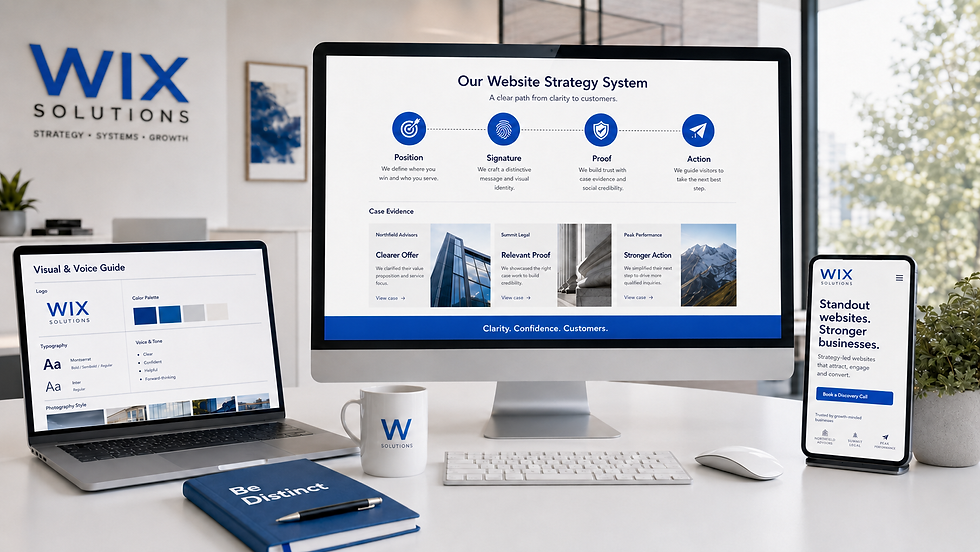
A Standout Website starts with a defendable difference
Begin with what the business can credibly own. A difference may come from audience, method, expertise, operating model, product, perspective, service experience or proof. “We care” is not a difference unless the business can show a practice competitors do not share.
Write three versions of the positioning. First, a plain operational version: who, what, for whom and how. Second, a customer version: the outcome and tension in language the audience recognises. Third, a memorable expression: the phrase, analogy or image that makes the position easier to recall.
Relevant: the difference matters to a valuable customer decision.
Credible: the business can prove or demonstrate it.
Specific: the claim excludes something and creates a boundary.
Repeatable: the idea can guide services, content and customer experience.
Expressive: the idea can become language, imagery, diagrams or interaction.
Our Wix Website Design service connects positioning with page structure and responsive experience. If the difference is not yet visible across the brand, explore Branding & Visual Identity.
Create one signature idea
Memorable websites often contain a recognisable device: a diagnostic map, a distinctive editorial voice, a product demonstration, a visual metaphor, an interactive comparison or a recurring evidence format. The device is not decoration; it makes the position easier to understand.
Choose one signature idea before inventing many effects. If a consultancy sells clarity, a live model of its decision process may be more distinctive than animated gradients. If a maker sells material quality, macro photography and provenance may carry the identity. If a venue sells atmosphere, a carefully paced visual tour may be the proof.
The signature should survive beyond the home page. It can shape service diagrams, case studies, social content and proposals. A one-off hero trick is an event; a repeated idea becomes a brand asset.
Use voice to establish point of view
A website sounds distinctive when it makes choices. It knows which customer it is addressing, which industry clichés it rejects, how it explains risk and how direct it is willing to be.
Collect examples of language the brand would say, might say and would never say. Define how it handles claims, humour, technical detail, price, uncertainty and calls to action. Then apply the voice to small interface moments as well as headlines: navigation, forms, errors and confirmations.
Distinctive does not mean obscure. A clever headline that hides the service forces every visitor to translate it. Pair memorable language with an explicit explanation. The visitor should not have to solve the brand before deciding whether it is relevant.
Wix Solutions can connect voice with structure through Content Writing & Website Copywriting.
Make proof part of the identity
Many businesses look similar because they present proof in the same generic way: logo strip, quotation carousel, round number. Standout proof reveals how the business thinks and what changed.
A case study can become a recognisable editorial format. Show the starting condition, decision, method, constraint, evidence and lesson. A product brand can standardise demonstrations and comparisons. A service business can reveal process artefacts or before-and-after decisions without disclosing confidential data.
Do not manufacture outcomes. If quantitative evidence is unavailable, use accurate qualitative proof: process, expertise, sample, specification, policy or client language with permission. Precision builds trust more reliably than inflated numbers.
Browse the Website Designer Agency Case Study and our wider case studies for examples of structured project evidence.
Design a recognisable visual grammar
Colour and type matter, but distinctiveness often lives in the relationships: scale, spacing, crop, composition, shape, rhythm, icon style and motion. Define rules that can generate many pages without making them identical.
Build a small kit: typographic hierarchy, colour roles, image direction, signature shape or grid, icon principles, data treatment and component behaviour. Test the kit with real service pages, long headings, case evidence and mobile layouts.
A good system has contrast inside consistency. Editorial pages may be quieter than campaign pages; a case study may use denser evidence than the home page. The visual grammar stays recognisable while intensity changes with purpose.
For practical asset production, see Business Graphics Design and the website design glossary.
Use interaction to reveal value
Interaction earns attention when it helps a decision: filter a portfolio, compare options, estimate scope, explore a process or reveal detail progressively. Motion can communicate relationship, state and feedback.
Do not add interaction merely to make the page feel premium. Scroll traps, hidden navigation and excessive animation may make a site memorable for the wrong reason. Essential information and actions must remain available with keyboard use, reduced motion and ordinary devices.
Prototype the task before polishing the animation. If the interaction does not improve comprehension, confidence or control, remove it. Distinctiveness should reduce mental effort around the idea, not add effort around the interface.
Keep the conversion path explicit
A unique website still needs familiar affordances. Visitors should recognise the navigation, links, controls, forms and next step. Use distinctive expression around a conventional interaction model unless research supports a different approach.
Calls to action should describe what happens: Book a discovery call, Request a sample pack, Compare service plans. “Enter the experience” may fit a campaign, but it is weak when the visitor needs to know whether the button opens a form, a film or a shop.
A focused campaign can use a tailored landing page while the main website protects broader orientation. Distinction and conversion work best when message, evidence and action continue from channel to page.
Three contrasting standout website cases
These composite cases are illustrative. They show different sources of distinction rather than named-client claims or invented results.
Case study 1: a specialist accountancy practice
The practice looked identical to generalist competitors: city skyline, navy palette and “trusted partner” language. Its real difference was a monthly decision system for independent production studios.
The redesign made the monthly rhythm visible through a signature operating calendar, studio-specific examples and a direct editorial voice. Navigation remained conventional. The lesson: specialisation became memorable when the method—not a decorative theme—led the design.
Case study 2: a countryside wedding venue
The venue had beautiful images but presented them as an endless gallery. Couples could not understand the sequence of a day, wet-weather options or capacity. The redesign used a paced visual story of arrival, ceremony, meal and evening, with practical information beside each stage.
A seasonal image direction created atmosphere while clear booking actions remained persistent. The lesson: distinction came from turning photography into a decision narrative.
Case study 3: an industrial components manufacturer
The manufacturer assumed distinction required a fashionable rebrand. Research showed buyers cared about tolerance, compatibility and response. The website introduced a recognisable specification system, interactive compatibility filters and concise engineering diagrams.
The visual identity became precise rather than decorative. The lesson: a technical website stands out when it makes difficult evaluation easier.
Related reading: The Essential Components of a Successful Website, How to Maximize Your Brand’s Online Presence and Basingstoke Brands: Build a Digital Home That Feels Like You.
A distinction workshop
List the category conventions. Record the repeated claims, images, colours, layouts and proof patterns customers see.
Name the valuable difference. Choose an audience, method, perspective or evidence that matters to the decision.
Make the difference visible. Translate it into one signature device, editorial format or interaction.
Protect clarity. State the offer explicitly and retain familiar navigation and controls.
Build the grammar. Define reusable rules for type, colour, image, shape, icons, evidence and motion.
Test recognition and tasks. Ask people what they remember and whether they can still complete key journeys.
Extend carefully. Apply the idea to services, cases, campaigns and proposals without turning it into a gimmick.
Standout Website distinctiveness checklist
The priority audience and defendable difference are stated explicitly.
The opening explains the offer even if the memorable headline is removed.
One signature idea makes the position easier to understand or remember.
Voice guidelines cover claims, technical language, uncertainty and interface copy.
Proof is structured as evidence rather than decorative testimonials.
Visual rules generate variety without creating unrelated pages.
Interaction improves a decision and remains accessible across input methods.
Navigation, links, forms and calls to action remain recognisable.
The same distinctive idea can extend into campaigns and sales materials.
Testing measures both memory and successful task completion.
Questions and answers
Does a standout website need unusual navigation?
Usually not. Familiar navigation reduces effort. Distinctiveness is better created through positioning, content, evidence, imagery and purposeful interaction unless user research shows a different navigation model is genuinely better.
Can a template produce a distinctive website?
Yes, if structure, content, visual rules, imagery and components are adapted around a real brand position. A template is a starting system, not a finished identity.
How many brand colours should be used?
Use the number needed for hierarchy, identity and states. One primary colour with neutrals and functional accents may be enough. A large palette does not create distinctiveness without consistent roles.
Should every page look different?
No. Pages should vary with purpose while sharing a recognisable grammar. If every page invents its own rules, visitors must relearn the interface and the brand becomes weaker.
Is animation necessary?
No. Motion is useful for feedback, relationship and emphasis when it respects performance and reduced-motion preferences. Static typography, image and structure can be highly distinctive.
How do we test whether a website is memorable?
After a short exposure, ask representative people what the business does, who it is for and what visual or verbal idea they recall. Pair that with task testing; memory without usability is not success.
Be remembered for the right reason
A standout site makes the business easier to describe and easier to choose. It does not confuse novelty with value.
If your Wix website feels competent but interchangeable, contact Wix Solutions. We can help define the difference and build a clear system around it.
Bibliography
Wheeler, Alina. Designing Brand Identity: An Essential Guide for the Whole Branding Team. 5th edition, 2017.
Neumeier, Marty. The Brand Gap. Revised edition, 2005.
Sharp, Byron. How Brands Grow: What Marketers Don’t Know. 1st edition, 2010.
Lidwell, William; Holden, Kritina; and Butler, Jill. Universal Principles of Design. 3rd edition, 2023.


