Features Every E-commerce Site Should Have

An online shop succeeds when customers can find the right product, understand it, trust the business and complete the purchase without avoidable uncertainty. Attractive product photography helps, but the complete e-commerce experience also depends on navigation, stock accuracy, delivery information, accessible interaction, secure payment and reliable operations.
Wix Solutions designs e-commerce websites as connected retail systems. The storefront, product data, checkout, fulfilment communication, content and reporting must use the same rules. A feature is valuable only when it supports a customer need and the business can maintain it.
An e-commerce site needs a clear shopping journey
The core journey is discover, evaluate, select, pay, receive and—when necessary—return or request help. Different stores add subscriptions, bookings, collections, finance or trade accounts, but those functions should not obscure the basic path.
Discovery: navigation, search, filters, landing pages and useful content.
Evaluation: accurate images, descriptions, variants, price, availability and evidence.
Selection: clear options, quantities, delivery or collection choices and basket feedback.
Payment: transparent totals, trusted methods and a concise checkout.
Fulfilment: confirmation, tracking, collection instructions and support.
Retention: appropriate follow-up, account tools, replenishment or loyalty where useful.
For the wider design principles behind this path, read Creating User-Friendly Websites for Better Engagement.
1. Navigation based on how customers shop
Product categories should reflect customer language and decision-making. A complex catalogue may need routes by use, audience, type, brand or compatibility. Avoid creating overlapping categories that lead to nearly identical pages.
Breadcrumbs, clear page titles and visible applied filters help people understand where they are. On mobile, navigation must remain concise and tap targets easy to operate. A large menu is useful only when its groups are meaningful.
2. Search, filters and sorting
Search should handle common product names, brands and identifiers, and it should provide a useful response when no exact result exists. Filters must use accurate attributes rather than values entered inconsistently by different staff.
Prioritise filters that change the purchase decision.
Show applied filters and make them easy to remove.
Keep result counts and availability current.
Provide sorting that customers understand, such as price, newest or relevance.
Test zero-results, one-result and large-result states.
Make filters and search operable by keyboard and screen reader.
3. Complete product information
A professional product page answers the questions that prevent purchase. Essential fields vary by industry but may include dimensions, materials, ingredients, compatibility, care, warranty, delivery restrictions, age guidance, licences or technical specifications.
Descriptions should be specific and original. Do not hide essential facts in an image or PDF. Use structured fields for repeatable data so comparisons remain consistent and editors do not forget important details.
4. High-quality, honest product media
Use consistent product photography with additional views that answer practical questions. Show scale, texture, use and relevant packaging. Video can demonstrate motion or assembly, but it should not replace accessible written information.
Optimise media for the displayed size, set useful focal points and use meaningful alternative text. Record image ownership and consent. Avoid presenting a colour, result or feature more favourably than the real product supports.
5. Price, variants and availability
Customers need to understand the price they will pay and the option they are selecting. Variant labels should be unambiguous, and unavailable combinations should not lead to a dead end. Stock information must reflect the organisation’s real process.
If stock is not live, use honest language such as “usually available” or require confirmation. For made-to-order products, explain lead times before checkout. Promotions need start and end dates, eligibility and clear terms.
6. Trust, reviews and policies
Trust comes from accurate company information, secure payment, understandable policies and consistent fulfilment—not from decorative badges. Show contact details, delivery, returns, privacy and complaint routes where they are relevant to the decision.
Reviews should be genuine, moderated under a clear policy and not edited to change their meaning. Explain how ratings are collected if that affects interpretation. Respond to product issues constructively rather than displaying only praise.
7. A useful basket
The basket should confirm products, variants, quantities and prices without forcing checkout. Customers need to edit or remove items, understand delivery thresholds and see when a promotion has or has not applied.
Do not introduce unexpected mandatory costs late in the journey. Cross-selling can be useful when it solves a real compatibility or replenishment need, but aggressive interruption weakens confidence.
8. A concise, transparent checkout
Allow guest checkout unless an account is genuinely required. Ask for the minimum information needed to process the order and fulfil legal obligations. Use clear field labels, specific validation and an order summary that remains visible.
Show the total, tax treatment where relevant and delivery charge before final confirmation.
Offer appropriate payment methods without overwhelming the page.
Make billing and delivery address choices explicit.
Preserve entered data after a correctable error.
Provide a final confirmation step for expensive or complex purchases.
Send an immediate order acknowledgement with a clear support route.
9. Delivery, collection and returns
Delivery information is part of the product decision. Explain areas, methods, thresholds, estimated times and exceptions before checkout. For collection, provide location, opening hours, preparation time and the identification required.
Returns information should be easy to find and written in plain language. Product-specific restrictions must be presented appropriately and comply with applicable law. Operational promises should match carrier and staff capacity.
10. Mobile-first commerce
Customers may discover, compare and purchase on a phone. Mobile design must protect product information, filters, variant selection, basket feedback and checkout. Sticky actions can help when they do not cover content or accessibility controls.
Test with real devices, payment methods and connection speeds. A responsive screenshot does not prove that the transaction is usable.
11. Accessibility
Accessible e-commerce supports product discovery and independent purchasing. Use logical headings, readable contrast, keyboard navigation, visible focus, labelled controls, descriptive errors and text alternatives. Product colour or stock status should not be communicated by colour alone.
Complex controls such as carousels, filters, date pickers and quantity selectors require particular attention. Documents, videos and support routes also need accessible alternatives.
12. Performance and resilience
Large catalogues and image-heavy pages can become slow. Use disciplined image sizes, sensible application choices and reusable page structures. Monitor important templates rather than testing only the home page.
Plan for payment failures, unavailable stock, expired promotions and integration delays. Error messages should help customers recover and provide another contact route when the business needs to intervene.
13. Product content and SEO foundations
Category and product pages need descriptive titles, headings, URLs and original content. Internal links from buying guides, comparisons and support content can help customers and search engines understand the catalogue.
Structured product data must match the visible page. Avoid generating many thin filter URLs for indexing. Learn more in
14. Accounts, wish lists and loyalty
Accounts can make repeat ordering, tracking and returns easier, but they should offer clear value. Let customers understand what data is stored and how to manage it. Wish lists, back-in-stock alerts and loyalty programmes need consent, reliable notifications and straightforward rules.
Do not require an account simply to capture marketing permission. Transactional communication and marketing communication serve different purposes and should be managed accordingly.
15. Support and post-purchase communication
Give customers a realistic way to ask about products and orders. Order confirmations, dispatch notices and collection reminders should use consistent details and link to a secure source of truth.
Support content can reduce repetitive enquiries when it is accurate and easy to find. Escalation to a person should remain possible for payment, delivery, accessibility and product safety issues.
16. Reporting and governance
Track meaningful events such as product views, filter use, basket additions, checkout starts, purchases, returns and support requests. Analyse the journey by product type and device, but avoid treating every movement as proof of causation.
Assign owners to product data, pricing, stock, promotions and policy content.
Use approval and review dates for regulated or safety-critical information.
Reconcile store orders with fulfilment and finance processes.
Audit permissions when roles change.
Test critical journeys after application or integration updates.
Maintain redirects when products or categories are retired.
Five illustrative e-commerce case studies
The following fictional examples demonstrate how e-commerce features change by business model. All names, people, testimonials, charts, figures and outcomes in the visuals are illustrative and are not claims about real Wix Solutions clients.
1. Outdoor retailer: navigate a deep catalogue
An outdoor retailer carries products across activities, categories, brands and seasons. The main challenge is helping customers reach relevant gear without a menu that becomes an uncontrolled inventory list.
The design groups the mega menu by activity, product type, brand and seasonal collection, then provides filters and a product finder. Desktop hover states have equivalent keyboard and mobile behaviours. Buying guides connect advice to products without replacing product specifications.

2. Educational toy store: shop by age and learning need
Parents may know the child’s age or interest but not the product category. The store therefore offers carefully governed age and subject filters, buying guides and clear materials and safety information.
Product imagery shows scale and use, while descriptions avoid unsupported developmental claims. Stock, delivery, returns and age guidance remain visible. Category pages use original explanatory content instead of generic product grids alone.

3. Farm shop: seasonal stock, collection and local delivery
A farm shop sells seasonal produce with changing availability and offers collection and defined local delivery. The website needs accurate stock language, product origins, delivery areas and collection slots.
A CMS supports recipes and seasonal guidance, while the store manages products and orders. Allergen information uses structured labels and review ownership. Delivery maps are accompanied by postcode checks and written thresholds so customers do not rely on the graphic alone.

4. Bicycle service: combine bookings, memberships and content
A bicycle business sells service plans rather than a conventional shelf catalogue. Customers need to compare repair options, choose a time, understand membership benefits and manage future bookings.
The design separates one-off services from recurring plans, uses a CMS for service and route content and provides a member area for bookings and benefits. Checkout and booking confirmation explain what to bring, how long the service may take and how changes are handled.

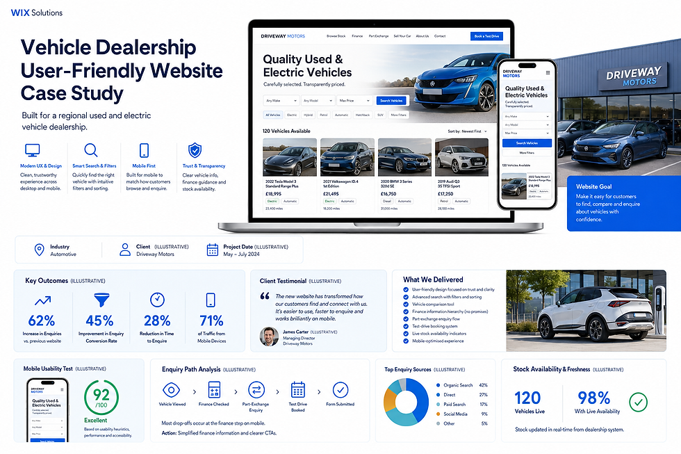
5. Vehicle dealership: live stock and high-consideration enquiries
A vehicle dealership requires rich filters, transparent specifications, finance information, stock freshness and distinct actions for test drives, part exchange and general enquiries. This is a high-consideration journey, so customers need to compare before contacting the business.
The website presents live availability and clear vehicle details without making unsupported promises. Mobile search keeps essential filters manageable. Finance content has appropriate disclaimers and review ownership, while the enquiry path records the vehicle and requested action.
What the five models teach
E-commerce is broader than a product grid and payment button. The outdoor store needs navigation depth; the toy store needs age and safety information; the farm shop needs local fulfilment; the bicycle service needs bookings and subscriptions; the dealership needs live stock and complex enquiry routes.
Wix Solutions selects and configures features around the business model. The result should be understandable to customers, manageable for staff and measurable after launch.
A launch checklist for Wix Solutions
Product, category, search, filter and zero-result testing.
Variants, stock, price, promotion and tax review.
Basket, checkout, payment failure and confirmation testing.
Delivery, collection, returns and support verification.
Mobile, keyboard, screen-reader and contrast checks.
Product titles, descriptions, URLs, alternatives and structured data.
Order notifications, automations and fulfilment ownership.
Analytics, privacy, roles, permissions and post-launch monitoring.
For more detailed planning, continue with E-commerce Website Design.
Frequently asked questions
What is the most important e-commerce feature?
There is no single feature that works in isolation. Accurate product information, clear discovery, transparent fulfilment and a reliable checkout form the minimum coherent journey. Priorities then depend on the business model.
Should an online shop require customer accounts?
Usually not for a first purchase unless the product or service genuinely requires membership. Offer guest checkout and explain the value of an account, such as order history, subscriptions or easier returns.
How many product filters should a store use?
Use the filters that materially change the decision. Too many inconsistent filters create more confusion than value. Base them on structured, maintained product attributes and review search behaviour.
Can Wix support a growing e-commerce business?
Wix can support catalogues, payments, orders, promotions, bookings, subscriptions and content-led commerce. The appropriate setup depends on catalogue complexity, integrations, fulfilment and operational requirements.
Conclusion
The essential features of an e-commerce site are the parts that create a dependable end-to-end experience: discovery, accurate evaluation, selection, payment, fulfilment, support and governance.
Wix Solutions designs those parts around the way the business sells and fulfils. Start with the complete customer journey, maintain product data carefully and add advanced features only when they solve a demonstrated need.
Bibliography
Laudon, Kenneth C.; Traver, Carol Guercio. E-commerce 2023–2024: Business, Technology, Society, 18th edition.
Rosenfeld, Louis; Morville, Peter; Arango, Jorge. Information Architecture: For the Web and Beyond, 4th edition.
Krug, Steve. Don’t Make Me Think, Revisited: A Common Sense Approach to Web Usability, 3rd edition.
Tidwell, Jenifer; Brewer, Charles; Valencia, Aynne. Designing Interfaces: Patterns for Effective Interaction Design, 3rd edition.
Saleh, Khalid; Shukairy, Ayat. Conversion Optimization: The Art and Science of Converting Prospects to Customers, 1st edition.