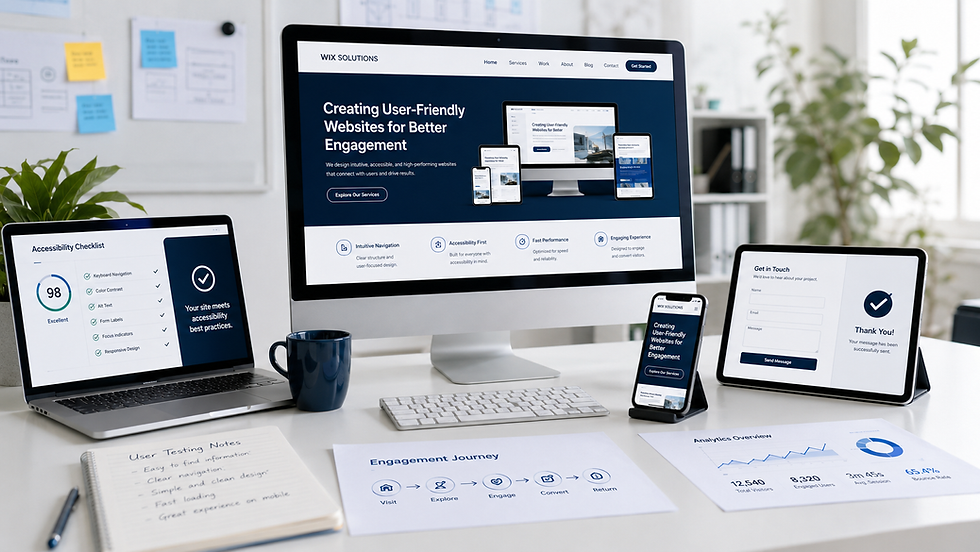
Wix Editor Studio tutorial

Wix Studio gives business owners and design teams a flexible way to build responsive websites, manage structured content and connect the site to practical business tools. Flexibility, however, makes a clear working method essential. This tutorial explains how to move from a business brief to a maintainable Wix Studio website without losing control of layout, content or quality.
The goal is not to memorise every control. It is to understand the decisions behind the interface: what should become a reusable component, what belongs in the CMS, how a layout should adapt between screen sizes and what must be checked before publishing. Interface labels can evolve, so use this guide as a durable workflow and confirm any changed controls in Wix Help.
Wix Editor Studio tutorial: start with the site brief
Before opening the editor, write down the website’s primary audiences, offers and actions. A retailer may prioritise product discovery and checkout; a service business may need qualification and enquiry; a venue may require availability information. The brief prevents the canvas from becoming a collection of attractive but disconnected sections.
Define one primary action for each important page.
List the content that changes frequently, such as products, projects, people, courses or events.
Identify the evidence visitors need before acting: credentials, specifications, prices, policies, reviews or case studies.
Decide who will edit content after launch and what permissions they require.
Record required business tools, forms, tracking, accessibility and legal information.
If you are still deciding the website’s foundation, begin with Wix website design and Creating User-Friendly Websites for Better Engagement.
1. Understand the Wix Studio workspace
Open the site from the Wix dashboard and spend a few minutes identifying the canvas, page controls, Add panel, Layers panel and Inspector. Their names may vary slightly as the product develops, but their roles remain consistent: the canvas shows the page, Layers reveals structure, and the Inspector controls the selected element’s appearance and behaviour.
Use Layers when an item is difficult to select or when you need to understand nesting. Rename important sections and containers so collaborators can recognise them. Lock finished background elements when appropriate, and avoid placing unrelated elements in a container merely because they appear close together.
2. Build structure before decoration
Create the page hierarchy and core sections before refining colour, shadows or animation. A typical service page might include an outcome-led opening, service explanation, evidence, process, FAQs and a focused call to action. The order should follow the customer’s questions.
Use sections, containers, stacks and grids intentionally. Elements that must move together should share a meaningful parent. Repeated cards should follow one consistent pattern. This makes responsive adjustments predictable and reduces manual corrections later.
3. Set responsive behaviour deliberately
Wix Studio supports responsive layouts across breakpoints. Start with the widest layout, then inspect narrower breakpoints and adjust where the design genuinely needs a change. A good responsive system is not three unrelated designs; it is one hierarchy that adapts.
Prefer relative sizing, grids and stacks where content should reflow.
Check minimum and maximum widths so text does not become too wide or too compressed.
Keep essential buttons and information visible without relying on hover.
Review line length, heading scale and spacing at every breakpoint.
Use focal points and image containers carefully so important subjects remain visible.
Test real content: long headings, multiple prices and empty CMS fields reveal problems that placeholder text hides.
Do not treat the mobile view as a final clean-up task. Many customers will first encounter the site on a phone, so navigation, forms and primary actions deserve the same attention as desktop presentation.
4. Create reusable design rules
Set consistent type styles, colours and spacing early. Reusable sections or components are useful for headers, calls to action, testimonials, feature cards and other patterns that recur across pages. Reuse should reduce inconsistency, not force every page into the same shape.
When a pattern changes, ask whether the update should affect one instance or the shared system. Name variants clearly and document exceptions. A small, well-governed component set is easier to maintain than dozens of near-duplicates.
5. Use the CMS for repeatable content
If several items share the same fields, consider a CMS collection. Projects, team members, services, events, courses and locations are common examples. Define fields before designing the dynamic page: title, summary, image, category, date, status, call-to-action link and any sector-specific details.
Connect page elements to the correct dataset, then test multiple records. Add validation and guidance for editors, and decide what should happen when an optional field is empty. Permissions must match the sensitivity and ownership of the data.
6. Add navigation and purposeful calls to action
Navigation should reveal the site’s structure without asking visitors to decode internal terminology. Use clear page labels, provide an obvious mobile menu and make the primary action easy to find. Large product or service ranges may benefit from grouped navigation; our
Wix Studio mega menu guide explains the planning principles in detail.
Buttons should describe the result of clicking: “Request a quote”, “Check availability” or “View course dates” is clearer than “Learn more”. Link states, focus states and keyboard navigation are part of the design, not optional polish.
7. Configure forms, automations and business tools
Keep forms proportionate to the next step. A first enquiry rarely needs every detail the business may eventually collect. Use clear labels, helpful error messages and a confirmation that explains what happens next. Test notification recipients and avoid collecting sensitive information unless it is necessary and appropriately managed.
Bookings, Stores, Events or other Wix business tools should fit the same customer journey and visual hierarchy as the rest of the site. Automations can confirm an action or notify the team, but they should not compensate for an unclear process.
8. Prepare content and essential SEO
Write one descriptive page title and meta description for each important page, use a logical heading hierarchy, give images meaningful alternative text and create short, readable URLs. Internal links help visitors discover related information and help search engines understand relationships between pages.
Avoid duplicating pages simply to target small keyword variations. Useful content should answer a distinct need. Compress imagery, remove unused media and check that important text is real text rather than embedded inside an image.
9. Test before publishing
Preview the site and test it like a customer rather than its creator. Use multiple browsers and real devices where possible. Complete forms, bookings and purchases; inspect confirmation messages; follow navigation and footer links; and check empty, error and success states.
Responsive layout at every configured breakpoint.
Keyboard navigation, visible focus, contrast and text alternatives.
Forms, consent, notifications and automated responses.
CMS records, filters, dynamic pages and missing-field behaviour.
Menus, buttons, internal links and external destinations.
Page titles, descriptions, social previews and redirects.
Image weight, video behaviour and any obvious loading delays.
Roles, permissions, domain settings and analytics.
Save and preview regularly. Publish only after the responsible person has approved content and the critical journeys pass. After launch, run a short live-site check and keep a record of issues, owners and review dates.
Five illustrative Wix Studio exercises
The following fictional examples show how the same tutorial principles produce different systems. Names, testimonials, charts, figures and outcomes in the visuals are illustrative. They are planning examples, not claims about real Wix Solutions clients.
1. Outdoor retailer: a navigable product range
The retailer’s challenge is not simply adding more menu items; it is helping shoppers move from activity to product type, brand and seasonal collection without becoming lost. In Wix Studio, the exercise begins with a structured content map and a reusable navigation pattern.
The desktop mega menu, mobile drill-down and product finder must share the same vocabulary. Responsive testing checks that keyboard focus, hover states and tap targets remain usable. A CMS-backed buying-guide collection creates durable links between advice and relevant products.

2. B2B software provider: clarity before the demo request
A software buyer needs to understand the problem solved, compatible integrations, use cases, pricing logic and evidence before requesting a demonstration. The Wix Studio structure therefore uses reusable product sections, a CMS for use cases and documentation, and a carefully qualified demo form.
Responsive layouts protect diagrams and comparison cards from becoming unreadable on smaller screens. User testing focuses on whether visitors can find integrations, understand plan differences and reach the correct next step without marketing jargon.

3. Engineering manufacturer: structured technical evidence
An engineering manufacturer needs sector pages, capability detail, specifications, certifications and a useful request-for-quote journey. Wix CMS can maintain capability and project records while dynamic pages enforce consistent structure.
The design exercise tests specification tables, data-sheet access and imagery at every breakpoint. Forms ask only the questions required to route an enquiry. Accessibility work covers tables, download labels and keyboard order, while content governance assigns an owner and review date to technical claims.

4. Community pharmacy: capacity and safe information boundaries
A pharmacy website can explain services and offer appropriate appointment booking, but it must not imply personal clinical advice from generic web content. The Studio build separates service discovery, booking and urgent-care signposting, with clear ownership of regulated information.
The illustrative analysis uses service demand and capacity to shape navigation and available appointment types. Forms collect the minimum appropriate details, and permissions restrict sensitive operational content. Accessibility, privacy and review workflows are release requirements, not later additions.

5. Wedding venue: image-led design that remains useful
A venue website relies on strong photography, but visitors still need to compare ceremony spaces, reception options, accommodation, availability and planning information. The Studio layout uses image-led sections with controlled aspect ratios and focal points, while the underlying content model keeps venue details consistent.
Responsive tests confirm that imagery does not hide essential copy or slow the page unnecessarily. An availability enquiry asks for the date, guest range and event type, then explains the response process. Redirect planning protects useful links during a redesign.

A sensible Wix Solutions workflow
Wix Solutions uses a phased process so the design remains connected to business needs:
Discovery and content audit.
Page architecture and user journeys.
Visual system and responsive prototypes.
Studio build, CMS and business-tool configuration.
Content population and internal linking.
Accessibility, responsive and functional quality assurance.
SEO essentials, analytics and launch preparation.
Handover, governance and planned improvement.
The phases can overlap, but each has a clear decision to make. That discipline prevents cosmetic changes from masking structural problems and gives business owners a maintainable site rather than a fragile design file.
Frequently asked questions
Is Wix Studio suitable for a small-business website?
Yes. Wix Studio can support a focused service website as well as more structured projects. The build should remain proportionate: use CMS collections, components and integrations only where they reduce repetition or support a real customer and operational need.
Should I design desktop or mobile first?
Begin with the content hierarchy, then choose the viewport that best exposes the difficult layout decisions. Many teams establish the wide-screen structure first and continuously validate smaller breakpoints. The essential rule is to treat mobile as part of the design process, not a final adjustment.
When should I use Wix CMS?
Use the CMS when multiple records share a repeatable field structure or need filters, dynamic pages or controlled editing. A handful of unique sections may be simpler to manage directly on the page.
Can Wix Solutions update an existing Wix Studio site?
Yes. An existing site can be audited for structure, responsive behaviour, content management, accessibility, performance and customer journeys. Improvements can then be prioritised without rebuilding everything automatically.
Conclusion
A successful Wix Studio website comes from sound structure, responsive rules, governed content and thorough testing. The interface gives you the tools; the brief and working method determine whether those tools create a coherent customer experience.
Use this tutorial as a repeatable checklist. Build the hierarchy first, test with real content, keep components and CMS collections purposeful, and publish only when the complete journey works. Wix Solutions can help translate that method into a professional site that your team can confidently maintain.
Bibliography
Krug, Steve. Don’t Make Me Think, Revisited: A Common Sense Approach to Web Usability, 3rd edition.
Garrett, Jesse James. The Elements of User Experience: User-Centered Design for the Web and Beyond, 2nd edition.
Tidwell, Jenifer; Brewer, Charles; Valencia, Aynne. Designing Interfaces: Patterns for Effective Interaction Design, 3rd edition.
Marcotte, Ethan. Responsive Web Design, 1st edition.
Redish, Janice (Ginny). Letting Go of the Words: Writing Web Content that Works, 2nd edition.