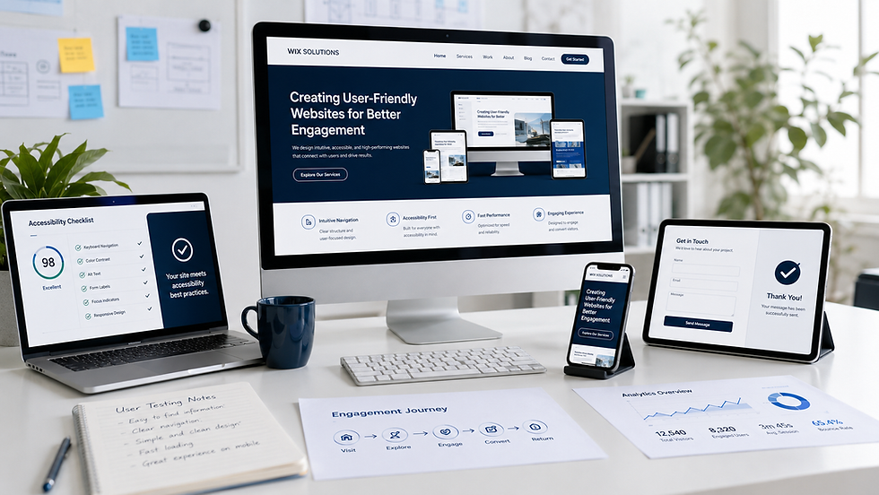
How to Use Wix Editor Studio for Small‑Business Sites

A small-business website has to do several jobs at once. It must introduce the business, answer practical questions, earn trust and make the next step easy—often with a small team maintaining it. Wix Studio can support that work, but the site becomes effective only when its structure and editing process are kept deliberately simple.
This guide shows business owners and in-house teams how to use Wix Studio as a manageable operating tool, not merely a page designer. It focuses on the decisions that matter after launch: consistent layouts, organised content, clear forms, sensible permissions and routine quality checks.
How to use Wix Editor Studio for a small-business site
Begin with one business objective and one primary customer action. A construction company may want qualified tender enquiries; a shop needs product discovery and purchase; a practice needs a safe enquiry route. Write that action at the top of the brief and assess every page against it.
The interface may evolve, so specific labels can move. The durable method is to understand the page structure, keep reusable patterns consistent, manage repeatable content in the CMS and test every important journey before publishing.
Step 1: turn the business offer into a page plan
List the services or products customers actually recognise. Avoid organising navigation around internal departments unless customers use the same language. A focused small-business page plan often includes Home, Services or Shop, About, Evidence or Projects, Guidance, FAQs and Contact.
Give every page one clear purpose.
Identify the customer question each section answers.
Choose a primary call to action and one appropriate alternative.
Separate essential proof from general marketing claims.
Plan pages for genuinely distinct services or audiences, not minor keyword variations.
For the broader principles behind the plan, see Wix website design and Creating User-Friendly Websites for Better Engagement.
Step 2: establish the design system
Set the brand colours, typography and basic spacing before building many pages. Use a small number of heading levels and button styles. Create reusable patterns for service cards, calls to action, testimonials and contact information so later edits do not introduce accidental variations.
A design system should reduce decisions for the person maintaining the site. If editors repeatedly need to resize fonts, recolour buttons or recreate layouts, the system is not doing enough work.
Step 3: build sections with responsive logic
Use sections, containers, stacks and grids according to the relationship between elements. A heading, paragraph and button that form one message should remain grouped as the viewport changes. Cards in a row should follow one rule for wrapping and spacing rather than being positioned independently.
Check wide, medium and narrow breakpoints while each section is still simple.
Use readable line lengths and avoid oversized mobile headings.
Keep essential actions available without hover.
Set image focal points so products, people and buildings remain visible.
Test longer real headings and prices rather than relying on short placeholder copy.
A responsive site is not a desktop layout squeezed onto a phone. It should preserve priority, reading order and task completion on every supported screen.
Step 4: decide what belongs in the CMS
Use Wix CMS for content that repeats in a consistent structure: projects, team members, services, products, events, resources or case studies. Define the fields first, then design the dynamic page and list components around those fields.
Include editorial fields such as status, category, review date and internal owner where they help governance. Test missing optional values, different image shapes and unusually long titles. A content model is valuable only when the team can maintain it accurately.
Step 5: configure navigation
Keep the main menu concise and use familiar labels. The active page, keyboard focus and mobile menu must be understandable. A larger catalogue may need grouped navigation, but a mega menu should reflect a genuine information structure rather than display everything at once.
For complex ranges, follow the planning sequence in How to create a Mega Menu in Wix Studio.
Step 6: connect useful business functions
Add only functions that support the customer journey and team workflow. Forms, bookings, e-commerce, events and automations should have clear owners and confirmation steps. A first enquiry should request enough information to route the conversation without becoming an unnecessary application form.
Use visible field labels and specific validation messages.
Explain how and when the business will respond.
Send notifications to a monitored account, not an individual who may be absent.
Test confirmation emails and calendar entries.
Collect sensitive information only when it is necessary and properly governed.
Review integrations and permissions regularly.
Step 7: prepare trustworthy content
Replace broad claims with useful evidence. Show processes, qualifications, project types, delivery areas, prices or limitations where appropriate. Put policies and essential service information where customers need them rather than hiding everything in the footer.
Write for scanning: descriptive headings, short paragraphs and lists for comparable items. Alternative text should describe the purpose of meaningful images; decorative images do not need to repeat nearby copy.
Step 8: complete essential SEO fields
Each important page needs a concise, descriptive title, a helpful meta description, one primary heading and a readable URL. Link related pages naturally and ensure navigation can be followed without relying on scripts or visual cues alone.
Do not duplicate pages to target every nearby town or keyword variation. Create a location page when the business has distinct local information, a real branch or a genuinely different service area. Accuracy builds more trust than artificial coverage.
Step 9: test and publish safely
Previewing the home page is not enough. Complete the main task on every page type, including error and empty states. Test real devices where possible and involve someone who did not build the site.
Navigation, footer, buttons and external links.
Forms, bookings, checkout, confirmations and notifications.
CMS filters, dynamic records and optional fields.
Desktop, tablet and mobile layout.
Keyboard order, focus visibility, contrast and alternative text.
Page titles, descriptions, social preview and redirects.
Roles, permissions, domain connection and analytics.
Save changes frequently, obtain content approval and publish during a period when the team can perform a live-site check. Maintain a simple launch log with issues, owners and deadlines.
A weekly maintenance routine
A small business does not need to redesign its website every week, but it does need a repeatable review. Check new enquiries and failed forms, update time-sensitive content, review broken links, confirm that key staff and service information is current, and note customer questions that the site should answer better.
A monthly review can add search queries, page engagement and conversion paths. Use analytics as a signal for investigation, not as proof by itself. A page with fewer visits may still be valuable if it supports qualified customers.
Five illustrative small-business case studies
These five fictional scenarios show how Wix Studio decisions change by industry. All names, people, testimonials, charts, figures and outcomes in the visuals are illustrative planning examples and are not claims about real Wix Solutions clients.
1. Construction firm: qualify tender enquiries
A regional construction and fit-out business needs to present capabilities and completed work while filtering unsuitable enquiries. The site plan separates sectors, services and projects, then uses a CMS to keep project evidence consistent.
A tender form asks for project type, location, timescale and a concise description before routing the lead. Accreditation content has a review owner and date. On mobile, filters become simple controls and project cards remain readable without forcing visitors through a dense portfolio.

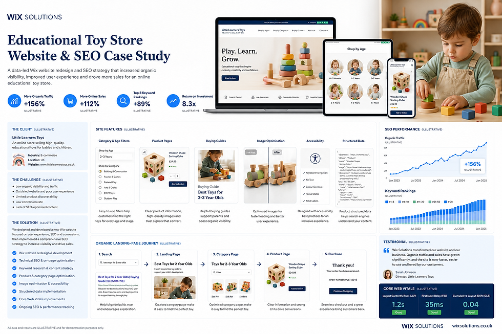
2. Educational toy store: make product choice easier
Parents often shop by age, stage, interest and material rather than by an internal stock code. The website therefore uses clear category filters, buying guides and consistent product information. Wix Stores handles the transaction while editorial content supports decision-making.
The design tests product grids, stock states, image dimensions, structured product information and accessible controls. Buying guides link to relevant collections without becoming thin sales pages. The small team can update products and guidance through defined templates.
3. Legal practice: guide clients without promising outcomes
A specialist legal practice needs calm navigation, clear service boundaries, solicitor profiles and an appropriate enquiry route. Content explains the nature of each service and the next step without presenting general information as personal legal advice.
The Wix Studio build uses reusable service-page sections, a governed guidance library and a triage form that avoids unnecessary detail. Accessibility and privacy are release requirements. Resource downloads have clear labels and ownership so outdated documents can be reviewed or removed.

4. Dental practice: separate routine and urgent journeys
A dental website should reassure patients and make essential information easy to find. Routine treatment, new-patient enquiries and urgent guidance are separate journeys. The site does not diagnose symptoms; it directs people to the appropriate contact route and clearly states any limitations.
Profiles, fees and treatment summaries follow controlled templates. The booking form uses plain labels and collects only appropriate information. Mobile testing prioritises calls, directions, urgent signposting and appointment actions, while accessibility checks cover contrast, focus and form errors.

5. Independent book publisher: connect launches and reader relationships
A small publisher needs more than a catalogue. Readers may discover authors, join an email list, attend events or pre-order a new title. The content model therefore connects books, authors, genres, events and campaigns without duplicating information.
Dynamic book and author pages keep metadata consistent, while a launch landing page supports one specific release. Email sign-up language explains what subscribers will receive. The team uses a campaign calendar and reviews engagement by content type rather than posting without a purpose.

What these examples have in common
The five businesses use different functions, but the underlying discipline is consistent: clear customer journeys, structured repeatable content, proportionate forms, responsive layouts and named content owners. Wix Studio supports the system; governance keeps it useful.
A small business should resist building every possible feature at launch. Start with the smallest complete experience that customers can understand and staff can maintain. Add functions when evidence shows a real need.
When to involve Wix Solutions
Business owners can safely update text, images, products and CMS records when the system is well designed. Professional support is useful when the site requires a new information architecture, responsive redesign, complex CMS relationships, e-commerce migration, accessibility remediation, custom integrations or careful redirect planning.
For a deeper walkthrough of the editor workflow, continue with Wix Editor Studio tutorial.
Frequently asked questions
Can a small business manage a Wix Studio site without a developer?
Yes, if the site uses clear roles, reusable patterns and a well-structured CMS. Owners should receive handover guidance and avoid changing global layout rules without understanding their responsive effect.
How many pages should a small-business website have?
There is no ideal number. Create enough pages to explain distinct services, products and customer needs clearly. A concise site with useful pages is better than a large site filled with repetitive or thin content.
Should every repeated item use the CMS?
No. Use the CMS when repeatable fields, filters, dynamic pages or controlled editing provide genuine value. Two unique sections may be easier to maintain directly on their pages.
How often should the site be reviewed?
Check operational content and critical forms weekly, and complete a broader monthly review of performance, search visibility, broken links and customer questions. Legal, clinical, price and availability information may require a stricter schedule.
Conclusion
Wix Studio can give a small business a professional, responsive and maintainable website when the build follows a clear operating model. Start with customer actions, create a modest design system, use the CMS purposefully and test the complete journey.
Wix Solutions helps business owners turn those principles into a site their team can run with confidence. The strongest result is not the most complicated build; it is the one that remains accurate, useful and easy to improve.
Bibliography
Krug, Steve. Don’t Make Me Think, Revisited: A Common Sense Approach to Web Usability, 3rd edition.
Garrett, Jesse James. The Elements of User Experience: User-Centered Design for the Web and Beyond, 2nd edition.
Tidwell, Jenifer; Brewer, Charles; Valencia, Aynne. Designing Interfaces: Patterns for Effective Interaction Design, 3rd edition.
Redish, Janice (Ginny). Letting Go of the Words: Writing Web Content that Works, 2nd edition.
Halvorson, Kristina; Rach, Melissa. Content Strategy for the Web, 2nd edition.