Winchester Website Accessibility: A Practical Business Guide

Updated: Sep 24, 2023
Winchester website accessibility matters whenever people need to discover, compare, book, buy, enquire or plan a visit online. A polished page can still exclude someone if the text cannot be enlarged, the keyboard focus disappears, a booking calendar is unusable or essential access information is buried in an image.
This is especially relevant in a historic visitor city with attractions, events, hospitality, independent retail, professional services and organisations serving residents across the wider district. Official Visit Winchester resources foreground accessible visitor information and an accessible city trail, showing why detailed, accurate planning information is part of a useful welcome.

This guide explains how businesses can improve content, structure, presentation, forms, media, testing and governance. It includes four illustrative scenarios and a topic-specific responsible AI section. Accessibility is an ongoing quality discipline, not a badge or a guarantee created by one automated scan.
Define Winchester Website Accessibility by Task
Begin with the tasks people must complete, not a list of technical features. A visitor may need to check step-free access, compare dates, understand costs, request an adjustment or complete payment. A resident may need to find a service, read a policy or submit an enquiry. A professional client may need to evaluate suitability and arrange a consultation.
For each task, record the start page, information needed, interaction, confirmation and alternative route. Include temporary states such as a sold-out event, changed entrance or unavailable service. The journey should remain understandable when someone uses a small screen, keyboard, screen reader, zoom, speech input or adapted colours.
Audit Winchester Website Accessibility on Real Journeys
Choose a small set of high-value journeys and test them end to end. Inventory the pages, menus, maps, documents, forms, emails and third-party tools involved. Record barriers, severity, affected users, owner and retest date. Fix blockers in booking, payment, urgent information and contact before cosmetic inconsistencies.
The key elements of effective website design guide connects accessibility with navigation, responsive layouts, trust and clear actions. Use those elements as one system rather than treating accessibility as a final checklist.
Publish Accurate Access Information
Describe facilities without vague labels
State what customers need to plan: entrances, steps or gradients, lifts, door widths where verified, seating, toilets, parking, drop-off, hearing support, assistance-dog arrangements, lighting, noise, quiet options and staff assistance. Not every business needs every detail, but 'fully accessible' is rarely informative enough.
Explain who checked the information and when it was last reviewed. Provide a contact route for individual questions without making people disclose more than necessary. If access depends on a temporary route, staff availability or prior notice, say so clearly before booking.
Keep digital and physical journeys consistent
The website should match signs, booking messages and front-line practice. If the accessible entrance differs from the main entrance, the confirmation and map should explain it. If a companion or carer ticket needs a particular process, present it before checkout rather than after payment.
Do not copy access information from directories without checking the current operation. An accurate statement about a limitation is more useful than a broad promise that fails on arrival. Give access facts named owners and event-triggered reviews when facilities, routes or policies change.
Structure Pages for Understanding
Use headings, links and language well
Use one clear page title and a logical heading sequence. Write descriptive link and button labels that still make sense out of context. Keep sentences direct, define specialist terms and place instructions before the control they affect. Do not rely on position, shape or colour alone to explain what happens next.
Navigation names should reflect customer tasks. Avoid several links called 'read more' or menus organised around internal departments that visitors do not recognise. Repeated components should behave consistently across pages, including the mobile view.
A review of website design fundamentals can help teams connect purpose, hierarchy, content and responsive behaviour. Accessibility decisions are strongest when they begin in planning rather than being patched into finished pages.
Make Presentation Adaptable
Check colour, text and reflow
Use sufficient contrast for text, icons, focus indicators and controls. Test hover, error, disabled and selected states, not only the default screen. Text should remain readable when enlarged, and layouts should reflow without hiding content or requiring awkward horizontal movement at common zoom levels.
Avoid placing words inside promotional images when equivalent page text would work. When text is genuinely part of an image, provide an appropriate alternative. Decorative images should not create noise for assistive technology. Animations need restraint and suitable controls where motion or timing may cause difficulty.
Design meaningful media alternatives
Alternative text should communicate the purpose of an informative image, not repeat its filename or add keywords. Complex maps, charts and diagrams need a nearby explanation or data alternative. Video may require captions, a transcript and audio description depending on the content. Verify automatically produced captions before publication.
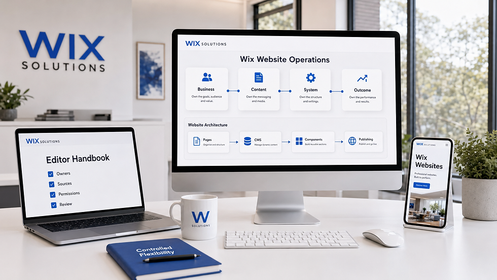
Well-managed Wix websites can use global styles, reusable sections and structured content to reduce inconsistency. Editors still need guidance so that new images, buttons and page blocks retain accessible patterns.
Build Forms and Bookings That Work
Use labels, instructions and clear errors
Every input needs an understandable label. Mark required fields in more than one visual way and explain expected formats before submission. When an error occurs, identify the field, describe the problem and preserve valid entries. Focus should move predictably so the user can recover without starting again.
Ask only for information needed to complete or route the task. Provide suitable autocomplete and input types where appropriate. Do not force disclosure of a disability to request a practical adjustment. Explain how information will be used and protect sensitive form data.
Test third-party steps
A website journey is only as usable as its calendar, ticketing, map, payment, chat or document viewer. Test embedded and external tools with keyboards, assistive technology and mobile devices. Make destination changes clear and provide a supported alternative when a necessary supplier cannot meet the journey.
Confirm receipt in plain language and distinguish a request from a reservation or appointment. State dependable response expectations and how to correct a mistake. Check confirmation emails for readable structure, meaningful links and essential access details.
Treat Documents, Maps and Events as Content
A PDF programme or illustrated map should not be the only source of opening times, prices, addresses, route changes or booking conditions. Put critical information in accessible page content. Use tagged, well-structured documents when downloads are justified, and name files so people can identify them after saving.
Events change quickly. Assign owners for dates, access arrangements, ticket conditions, venue routes and cancellation notices. Archive or redirect expired pages intentionally. If a festival uses several venues, give each venue its own verified access information and contact route rather than one generic statement.
Support Mobile and Low-Friction Use
Visitors may research while travelling, in bright light, on a weak connection or with limited time. Keep important content close to the top, use readable tap targets and avoid heavy media that delays the action. Do not hide an essential phone number, address or access note behind a complex interaction.
Performance supports accessibility but does not replace it. Compress appropriately, reserve media space to reduce layout movement and limit scripts that block input. Test actual mid-range phones as well as desktop emulation. Ensure orientation changes and browser text settings do not break the page.
Connect Accessibility with Search and Sharing
Clear page titles, headings, link labels and structured content also help search systems understand the website. Use accurate local details where they serve a real visitor decision. Do not create pages for every Winchester street or attraction unless the business has distinct, verifiable information for that journey.
Search snippets and social previews should represent the page honestly. Structured data must match visible content and the real organisation. Do not invent accessible facilities, locations, ratings or events in schema. Preserve relevant redirects when accessible guides or booking pages move.
Test with People and Evidence
Combine automated and manual checks
Automated tools can identify certain missing labels, contrast issues and code patterns. Manual testing is needed for keyboard order, focus visibility, zoom, reflow, error recovery, media controls and content meaning. Use current recognised accessibility criteria appropriate to the project, but do not treat a tool score as proof of usability.
Representative testing adds evidence that technical checks cannot supply. Plan it ethically, compensate participants appropriately where applicable and avoid asking one person to represent every disability. Record findings by task and retest the implemented change.
Create an accessible feedback route
Provide a straightforward way to report a barrier and say what information helps investigation. Make the route usable without the feature being reported. Give feedback an owner, response process and link to the change log. Repeated issues should influence component and editorial standards, not be fixed as isolated tickets.
Four Illustrative Winchester Journeys
Practical Example 1: A heritage attraction
An attraction publishes verified entrance, route, seating, toilet, sensory and assistance information beside tickets and opening details. Its interactive map has a text alternative. The team tests keyboard purchase and confirmation, reviews access facts after building work and offers a supported booking route when needed.
Practical Example 2: An independent restaurant
A restaurant makes menus readable as page content, explains dietary enquiry and access arrangements, and avoids posting essential details only as social-media images. The reservation tool uses clear labels and error messages. Staff confirm individual requirements without promising that every need can be met before checking.
Practical Example 3: A professional practice
A practice provides plain service and suitability information, keyboard-operable appointment requests and alternatives to telephone contact. It explains physical and remote meeting options without requesting unnecessary health details. Documents use headings and descriptive links, while sensitive form submissions follow approved privacy controls.
Practical Example 4: A retailer and event organiser
A shop promoting workshops connects accessible product browsing with verified venue, timing and booking information. Product imagery has useful alternatives, stock and collection rules are clear, and event updates appear on the page as well as in graphics. Staff test mobile checkout and review repeated support questions after each event.
Responsible AI for Website Accessibility
AI tools can help organise audit findings, suggest plain-language alternatives, draft testing scenarios and flag inconsistent link labels or image descriptions. They can create a first-pass transcript or caption file and group anonymised feedback themes. Each output requires review in its real page and customer context.
Do not ask AI to declare a website compliant or accessible from a screenshot or automated report. Do not fabricate Winchester access routes, facilities, opening information, adjustments, reviews or test participants. Do not upload customer messages, accessibility requests, medical information, account data or unpublished security details to an unapproved system.
Human owners remain accountable for factual accuracy, privacy, security, copyright, inclusive language and the working journey. Generated code, ARIA attributes, forms, schema and automations need technical review and assistive-technology testing. Incorrect accessibility code can create new barriers even when it sounds authoritative.
Measure Progress Without Misleading Scores
Track journey completion, form errors, booking abandonment, support requests, feedback themes, time to resolve barriers and recurrence after component changes. Segment carefully and protect privacy. A falling error rate may be useful evidence; it does not prove that every person can complete every task.
Use website analytics with consent-aware qualitative evidence and direct testing. Annotate releases, campaign changes, seasonal events and supplier updates before claiming that one accessibility change caused a business result.
Create a Practical Improvement Roadmap
First correct blockers and inaccurate access information. Next stabilise shared navigation, headings, focus, contrast, forms and document patterns. Then improve the busiest journeys and third-party tools. Finally, embed accessibility in design reviews, content approval, procurement, training and release testing.
Give every issue an owner, priority, target and retest. Preserve what works when redesigning. A small organisation can start with one booking or enquiry journey, but it should build reusable lessons rather than accumulating isolated fixes.
Choose Suitable Website Support
A useful partner should ask about audiences, tasks, content owners, third-party systems, testing and maintenance before promising a solution. They should explain scope and evidence honestly, involve the client team and avoid guaranteeing compliance, rankings, bookings or revenue.
Wix Solutions offers professional Wix website design that can be scoped around discovery, responsive components, content structure, forms, accessibility checks and handover. The right scope depends on the current barriers and operating model.
Conclusion
An accessible Winchester website helps more people understand the offer, plan with confidence and complete important tasks. Accurate physical access information, adaptable presentation, dependable forms and accountable testing must work together. Treat accessibility as ongoing service quality rather than a last-minute scan.
If you want to review a Wix visitor, booking or enquiry journey, contact Wix Solutions with the priority task, known barriers, third-party tools and current content owners.